Scoober – the best care for your best friend!
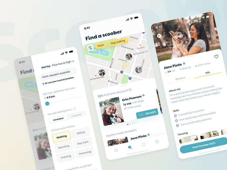
As part of Dribbble’s Product Design course, I created Scoober to help dog owners quickly find a trusty caretaker to leave their best friend with.
🚨 Problem
Dog owners want to find a trustworthy service when they cannot walk or sit their dog, while caretakers are looking for clients.
How do dog owners know about a caretaker's qualified capability, their skills, or their home’s suitability?
It's tricky for caretakers without any reviews to break through and prove that they're trustworthy and experienced
Trust is hard to build over an app, even more, when there's a time rush!
🔎 Research
User Research & Persona
The research was conducted with 1x face-to-face interview and an online survey with 14 dog owners, which shows the following key takeaways:
Only caretakers who have undergone and passed a thorough examination by the app operator should be listed
Dog owners want a meet-up beforehand to see if the caretaker meets their requirements and matches their dog
Users want to make new dog owner friends
Competitive Analysis
After testing Rover, Pawshake and Hundelieb, these pain points have been identified, showing directly what Scoober could improve:
• Housing situation on the caretaker profile is not or scarcely displayed
• Detailed filtering is not possible or overwhelming
• Contacting and Booking process is messy and confusing
🎯 Plan
With all the insights gathered, Scoober has now specific targets to implement:
Exploring caretakers should be possible from the get-go, so users can see the app's value faster
Supporting new caretakers without bookings by bringing focus on them
Emphasizing the animal-loving aspect to build trust more easily
Helping users to break the ice at the messaging step to save them time and effort
💡 Ideation
User Flow & Wireframes
Several iterations have been done
so that user reaches their goal with fewer steps
to make sure that the user is guided as logically and straightforward as possible
to identify which areas to emphasize on
Flow example — 1st goal from Welcome Screen
Visual Design
Clean UI
Clear in hierarchy for intuitive navigation
But still with some playfulness in font and color to resemble the nature of dogs
Design System
The Visual Design of the app has been built with responsive components with various properties and variants
for consistent scalability for future flows
to reduce complexity of the design system
to map the design components closer to code
🔁 Testing, Feedback & Reiterations
“The first pancake is always a blob!” 🥞
Continuing to iterate after valuable test results and feedback led Scoober to solve the key targets from the plan beyond the competition's solutions.
Some examples 👇
Results / Explore View
Users typically spend most of their time within an app or platform on this particular view. Simply presenting results as a map or list is not enough to provide additional value and stand out from the competition. That's why Scoober's solution includes:
the classic list view with key specs
a map that can be viewed in full-screen upon drag or tap
but also a carousel that supports new caretakers without ratings by bringing focus to them
Carousel's cards
have been improved to promote caretakers without ratings
with discount advertisement
by emphasizing on experience
by removing possible confusion (unexplained iconography)
Profile — Reviews Section
Has been set as the first readable content → it's what users always want to see first
Dogs give reviews, not their owner:
Emphasizes the animal-loving aspect to generate trust
Writing reviews as your dog is more fun and engaging → more ratings
🔥 Key Feature
After investing already so much value into a flow, no user should ever abandon it right before the finish line – especially due to such a silly but simple inconvenience! This is where Scoober steps in with a helping paw 🐾
🏁 Final Output
As a result, Scoober aims to address the competition's shortcomings and the pain points of dog owners by offering a simplified and streamlined search and contact experience.
The app allows users to browse without the need for sign-up or login, providing immediate value.
The platform supports new caretakers who have no ratings without compromising their credibility.
Additionally, dog owners can save time and effort by using message templates to initiate communication with potential caretakers.
☝️ My refined high-fidelity prototype in action — See for yourself and
test out the Scoober prototype on Figma! ✨
You've made it to the end! 👏


