Trippy
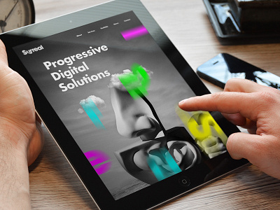
Surreal Website // Exploration Colour Pop VS Trippy
Developing a much more vibrant and 'electric' feel of colours that work well against the mono backgrounds. This direction enables the 'Surreal' letters pop put more. This again is another direction submitted, and is at it's early stages so any feedback is more than welcome. I can definitely visualize the letters with a parallax scroll effect.
See the design attached.
STUDIOJQ Do not own the rights to any of the images used and this is just a concept design project.
More by MadeByStudioJQ View profile
Like
