Italian family business branding
Plotting
Client didn't really know what she wanted.
But to me it was very clear: tiramisú, as a traditional italian dessert, needed something able to shout ITALIAN.
Who do I think with the premises "italian eleganzza+classic".
Couldn't stop thinking of the DRAMATISM of the Roman style typography
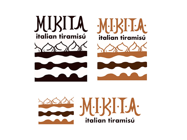
but the client then asked to move to a bolder-black typography
still on the fence, I took this other italianissimo direction:
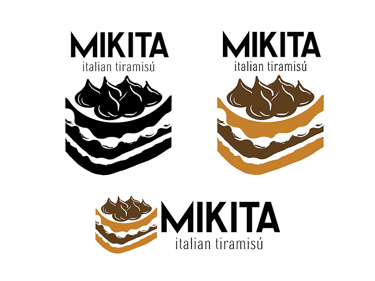
Ok, maybe more minimal
but wait, what if we gave more presence to a key ingredient with a lot of visual strenght? The chocolate powder!

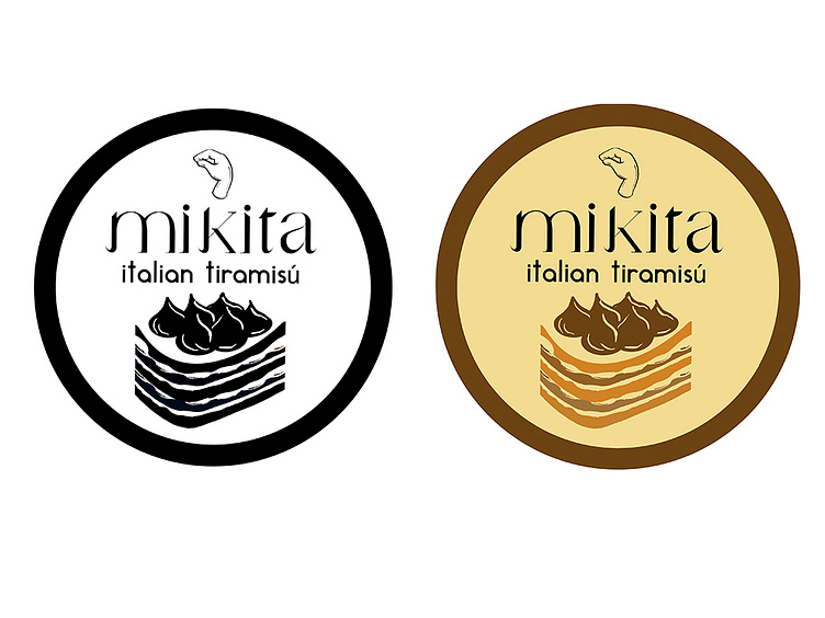
and mix it with a few of the initial elements
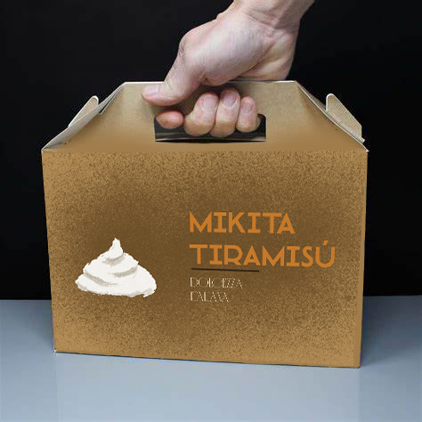
the client loved the idea, and then thought of remark another essential element: the whipped cream.
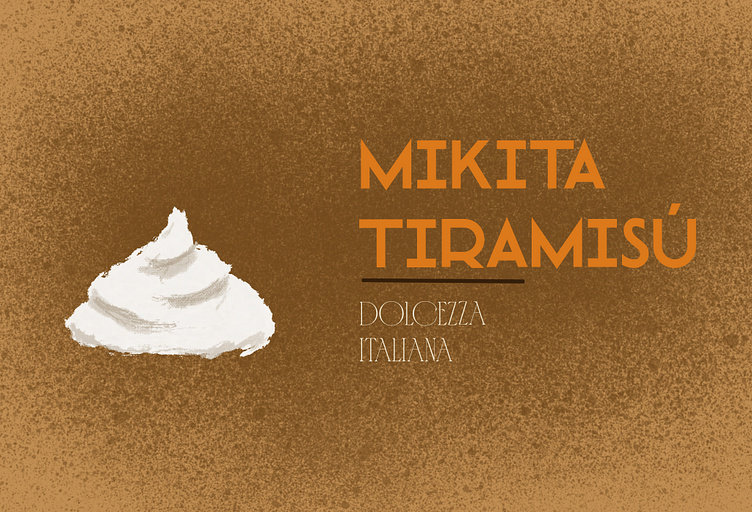
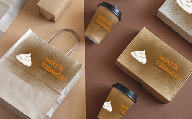
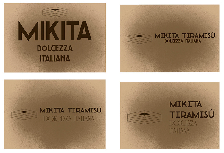
so this was the final result