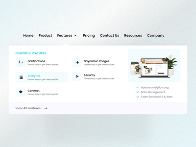
Minimal looking Flyout Menu Section
Hello Design People!!
Here is new shot! This time I designed an Flyout Manu or Mega Menu section of an SAS website. I designed this layout on very simple, tried to give it a simple and minimal look. In this design I showed different states and hover effects as well.
What do you think about this design?
Your feedback is appreciated! Don't forget to press "L" or ❤️ if you love it. Feel free to feedback and comment.
Come to hang out with me at
————————————————————
Let's connect with
https://www.facebook.com/Ahasanbashar
📩 Interested in UX/UI Design for Web or Mobile App? Feel free to reach out and contact us at imhasanbashar@gmail.com to tell us about your project. We'll love to collaborate.
More by Hasan Bashar View profile
Like
