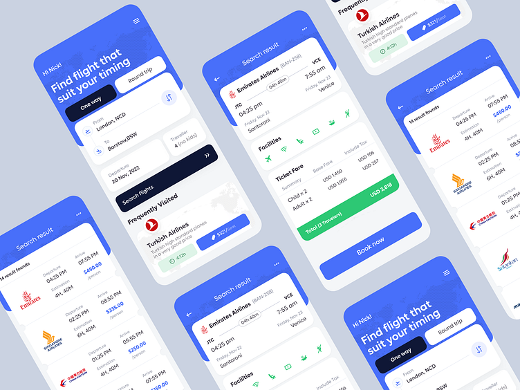
Flight Schedule and Air Tickets App
Hello, dribbblers!
We designed a concept for a flight booking app. During the app's design, we made sure not to make it cramped up with the information, and there are enough white spaces.
We also attempted to add features to maximize the experience of booking air tickets. For example, users can choose which flight to take based on the facilities and prices, and schedules after the search results.
To keep the UI stand out, we used a white background and light contrast colors to make it visually appealing.
What do you think about it?
We appreciate your interest, Dribbblers! 😍
Are you in rush? Pick your Schedule: https://calendly.com/musemind/30min
Contact us: hello@musemind.agency
Visit Our Website: musemind.agency
Check Our Design Case Study: Behance
Let's Check Our Others Dribbble Profile:
Musemind Saas • Musemind Mobile • Musemind Branding
Give Musemind a follow below:

