Availability Widgets - iOS (Seeker and Employer)
Some concepts that I've been working on with some of the availability inputs/views for the mobile apps at Snagajob
Job Seeker
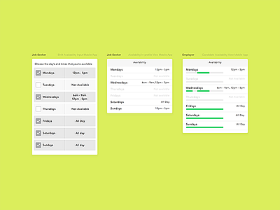
The job seeker input view allows for more specific input (i.e. days and times). Based on some research I conducted, allowing for more control, specific to the hours and timeframes is ideal on the seeker side and is expected - especially in the case of part time students. They can also add additional times in the same day as needed.
The "In-profile view" is more informational and is what the seeker would see in their core profile.
Employer Availability View
The idea here is to present the employer with a way to quickly glance and get an idea of a candidates availability. Based on research, employers are more interested in how flexible the candidates are.
Allowing the seeker to input specific times, this in turn would benefit the way the availability view is presented to the employer. The idea is to provide the employer with the most efficient way of skimming over the availability section and immediately getting an idea of how open they are (like, in less than 3 seconds).
In the concept, I stuck to a single color that spans over a period of time (the employer will likely associate that to their store hours like 9am -11pm). Sections of the bar is filled to match the seekers input of hours, multiple sections filled if there are more blocks of the day that they're available.

