Project Management Summary Dashboard
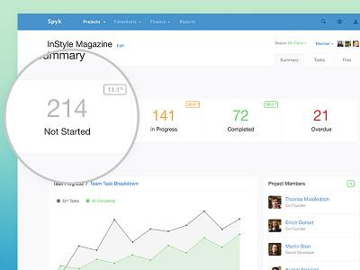
Attempting to work around a project summary (dashboard) view around a very specific and limited feature set. The challenge was to incorporate a prominent activity feed with a handful of metrics to drive the page. The tricky bit was understanding the limitations of the product and working around them to still put out a design that looked as good and not too limited.
The top of the view shows some key metrics around this specific project, attempting to show a SCRUM type format where tasks are listed in a sequential order from start to finish. Clicking each block would take a user to that page with tasks sorted.
Below the metrics is a task progress chart/graph that summarises total tasks Vs tasks completed. And also follows up with a prominent activity feed with infinite scroll for easy tracking of activities by your team members on this project.
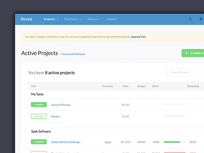
This product consisted of UX and UI work and also recreating the and reimagining the interface of the product from scratch. More screens to follow soon!


