Dog Walking Service - Mobile App
Overview
WOOF is a community of dog walkers ready to be hired by local dog owners. The goal was to make hiring a walker simple and safe while fostering a strong community of skilled walkers.
On this project I conducted user research, built wireframes and prototypes, and created developer ready high fidelity designs.
Understanding the users
After talking 1on1 with seven dog owners in my area, many of them had the same concerns and ideas about a dog walking service app.
These main takeaways highlight three important things that WOOF needs to support; safety of dogs and walkers, security of dogs, property and walkers, and timely processes to hire a walker.
Similarly, when talking with dog walkers in my community, they brought up the same ideas. Walkers want to make sure that they are walking dogs that they feel safe around, and walking in neighborhoods that are safe.
With this data I was able to build two personas to help guide my design.
Creating the user flow
The main focus of the user flow is to show how much detail users will be adding to their profiles without feeling overwhelmed or jumping ship. Onboarding is and opportunity gain all of the necessary information owners and walkers will need to feel safe and secure while using the service.
Ideation, wire framing, and prototyping
The visual design of this project went on a long journey. I found it hard to settle on a layout and eventually a visual style that felt easy to interact with.
Through iteration I was able to create a style that was easy on the eyes and didn't make the process of onboarding a slog.
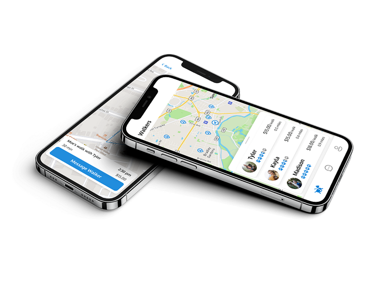
I had a similar problem with the main walker search function of the app. It was difficult to condense the important information down to a manageable size while still giving the user everything they need to use the service effectively.
Usability testing
With the main functionality of the product complete, I put the prototype into users hands and had them walk me through how they would make an account, how they would find a walker and how they would track their dog's walk.
From the tests, I got a lot of feed back, but not about the functionality of the app itself. From the pool of 6 users that I handed the prototype to, 5 of them had the same points of feedback. Text boxes, buttons, selectable options were hard to read, whether that was due to text size, color contrast, or a combination of the two. with that feedback I went back to iteration, boosting the contrast of all my elements to make everything more visible. On a second pass with 3 new users, The only complaint was with the card that tracked a dog's walk. Sometimes it was difficult to slide it back on screen when you tucked it away to the side, so I updated that functionality, making the card easier to interact with when its tucked off to the side.
Takeaways
Overall I think this project was a really great refresher on mobile first design thinking. I definitely learned a lot about how to layout information on a mobile device.
All of my users main worries were addressed through the app's design, features and onboarding structure. This included the security of a dog owner's property through walker background checks, safety of walkers and dogs through dog behaviors listed in their profiles and walk tracking using the walker's location services, and the service is easy to use and only takes 4 quick steps to schedule a walk.


