Dashboard for Stats Platform I Quotient
Salute!
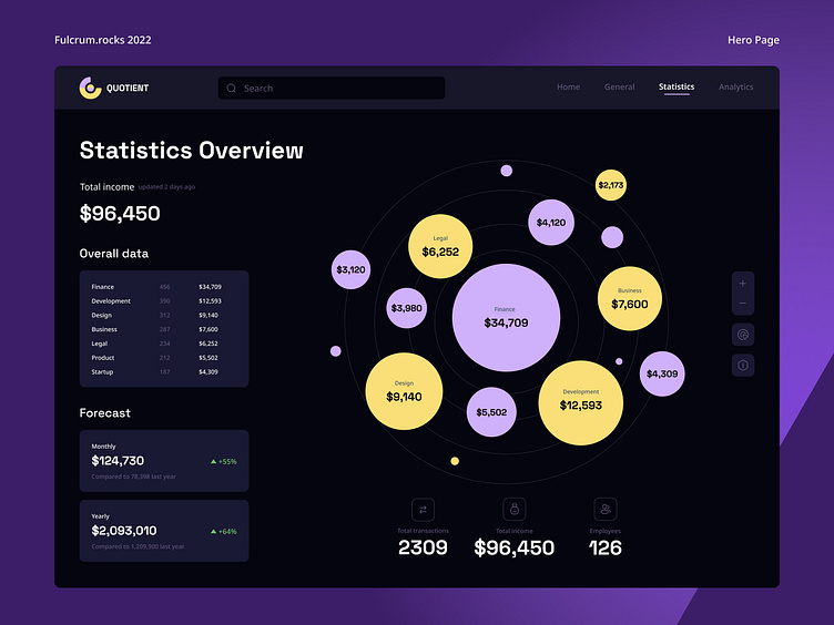
Should a statistics app be “grey” and boring to be efficient? Surely, no. For instance, check out the dashboard we’ve designed for Quotient, a stats platform that makes putting numbers together enjoyable. While creating the dashboard, we aimed towards a minimalistic UI that cuts back unnecessary blocks and emphasizes only the essential info like overall statistics, forecasts, total income, number of transactions, etc. with bright colors.
Do you like it?
Made with love by Fulcrum ❤️
🚀 Visit our website: https://fulcrum.rocks/
📩 Drop a line at hello@fulcrum.rocks