Junecloud.com redesign
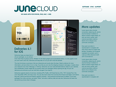
I just submitted a couple of big updates to Deliveries, so now it's time to switch gears for a bit and do some web design. I started working on a junecloud.com redesign over a year ago, but I got stubbornly attached to a design that had too many issues I couldn't resolve. (See the last attachment for a look at it.) The biggest problem was that most of the screen was blue unless you were scrolled all the way to the bottom of the page—it was just too much.
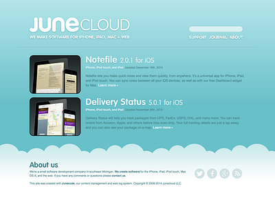
Something else I've struggled with a lot—both on the current site and the abandoned redesign—is how to put together images of a bunch of different devices without it looking busy and disjointed. I think the most important thing is that the background color has to contrast with the devices as little as possible. That was the focus is more on the screens and less on the devices themselves. So today I came up with this idea of having a dark background on the home page—where I often want to show a bunch of devices—and a light background everywhere else.
These are unfinished roughs at this point, but I like the way it's shaping up.


