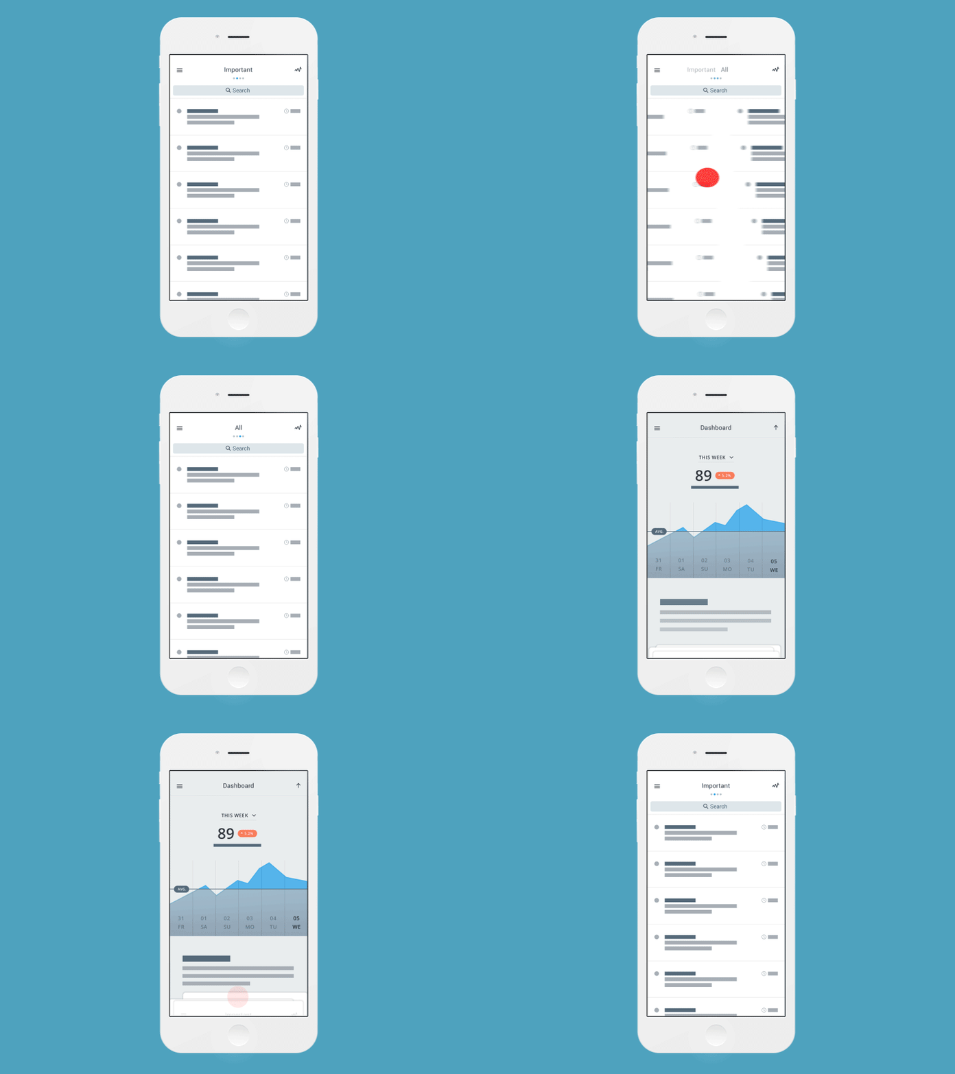
Traversing
Here are some interactions for a product I worked on in late 2014. Over 4 months and a ton of iteration, these interactions ended up being pretty close to what we sent off to development for the pilot. This design is 1 of 4 major versions we went through.
We begin interactions as soon as we have some basic wireframes to start stitching the flow together. It gives us an idea of how it might feel and lets us have the opportunity to pivot if it doesn't feel right, or the flow breaks down.
If any of this sounds or looks good you, we're hiring! Interaction, UX, Visual.. get ahold of us!
Creative Direction & Strategy: Bobby Ghoshal
Lead Visual Design: Joselle Ho
I've attached a full-res version of this shot that looks nice on your iDevice. There are a few other bonus micro interactions in there as well. Happy to answer any questions :)
