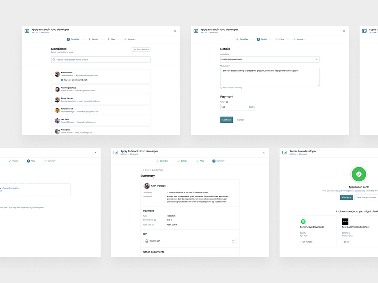
Redesign Job Application Process
The case study involves the update of the application process in a web service. The goal was to create a more streamlined and user-friendly process that would increase user engagement and satisfaction.
Background
After analyzing data from HotJar and Google Analytics, we identified that the current application process was causing high drop-off rates and dissatisfied users. The existing application process consisted of a single, long page with many UI elements, including form fields and buttons, which made it difficult for users to understand the progress of the application and what was required of them.
Step 1
Research and Analysis
To start, I conducted user interviews (10 users - 6 internal users, 4 external users), analyzed data on user behavior, and reviewed feedback from customer support to better understand user pain points and needs.
Confusing or complex form. The application form was too long, confusing, or required information that was not relevant to the application, causing frustration and leading to abandoned processes.
Lack of clear instructions. The application process was without additional hints and the instructions are not clear, which has led to confusion and errors.
Unintuitive navigation. The navigation was not intuitive and users struggled to find what they needed, leading to frustration and abandoned processes.
Unresponsive design. The application process was not optimized for mobile devices and was unresponsive, causing difficulty accessing and completing the application on mobile devices, leading to a poor user experience.
These UX problems created a negative experience for users and reduced the chances of successfully completing the application process.
Step 2
Ideation and Concept Development
After gathering insights from user research, I began prototyping different ideas for a step-by-step application flow in a modal window. Since we have a our own design system, I immediately created concepts from ready-made components. I shared them with the rest of the team, including product managers and developers, and we discussed the pros and cons of each idea. We ultimately settled on a design that included five clear steps (depends of role). We also added progress indicators and clear labels to help users understand where they were in the application process.
Step 3
Prototyping And Testing
Next, I developed a high-fidelity prototype in Protopie of the new application flow and conducted user testing with a group of current and potential customers.
Step 4
Implementation and Launch
Once we had a final design, I worked closely with developers to ensure that the new application flow was implemented seamlessly. We tested the new design thoroughly, including testing on different devices and browsers, to ensure that the user experience was consistent and user-friendly. We also made sure that the new design was accessible for all users, including those with disabilities.
Overall, the response was positive, with users expressing appreciation for the clear and easy-to-follow application flow. We then rolled out the new design to all users, and continued to collect feedback and make adjustments as needed.


