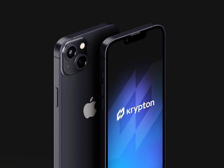
Krypton - Branding design for the NFT platform
Startup's branding is an effective visual tool that inspires people to connect, care and act.
Name of the presented project Krypton is a reference to a chemical element that is in the air. The Earth's atmosphere consists of one-millionth of krypton. The main idea is to show that NFT is around us and we literally breathe it.
Let's dive deep into the brand identity of this startup.
Logo design
The symbolic part of the logo represents the division of a human cell, but we designed it with a more technological and less organic style to reflect the crypto and blockchain industry.
This industry is known for its constant expansion, much like the cells of the human body.
By incorporating these elements into the logo, we aim to showcase the intersection of technology and biology in the world of crypto and blockchain.
Color palette
There are two basic colors, black and white, and an auxiliary gradient that serves as a separation of placements, graphics with a gradient are used only in digital, and in offline media they are monochrome, this technique is designed to emphasize the newness and diversity of the field and to emphasize its metaphysically.


