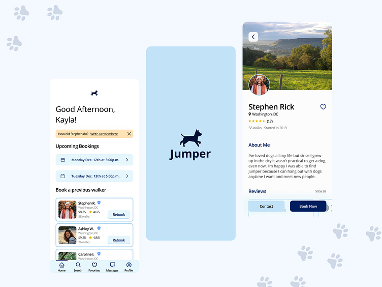
Dog Walker App
Intro
Creating this dog-walking app was part of Dribble's Product Design course.
Overview
The goal was to build a convenient dog-walking app to connect dog owners with dog walkers. The problem is that dog owners lead busy lives and don't always have the time to give their 100% to their furry friends. Jumper was created to give a helping hand and make sure your best friend is well taken care of.
User Research
During the research phase, I had five participants that I interviewed. Some were in-person, over the phone, and through text messages. I found that all participants preferred to have a family member or close neighbor walk or watch their dogs rather than handing them off to a stranger. This preference was based on the participants' desire for a responsible and familiar caregiver who they trusted to care for their dogs.
After conducting interviews and taking notes, I compared three different dog apps to gain a better understanding of what I wanted and needed to do. I also created a user persona to help me identify my target audience. By doing this, I was able to make informed decisions and tailor my app to better serve my users.
User Flow
I designed the user flows with a focus on creating a welcoming and engaging experience for new users. The approach I chose uses friendly, gradual steps to introduce users to the app and build trust. This approach aligns with the overall theme and aims to improve the user experience.
Wireframes
I started with low-fidelity wireframes with basic user patterns. The goal was to create a simple and intuitive design that would build trust with users. I created multiple versions of the profile screen to test different designs and ultimately settled on the one that worked best. This design became the foundation for the rest of my screens. By carefully considering the user experience and trust, I was able to create wireframes that will likely result in a successful final product.
Final Screens
The usability testing went well, and I was able to identify and address a few minor issues. In particular, we addressed a faulty dropdown menu and made some changes to the layout of the page to improve clarity and reduce confusion.
Summary
Working on this project, I gained a deeper understanding of the design process. From conducting interviews and research to ideation and prototyping, I realized the time and effort that goes into creating a successful app. Keeping thorough notes helped me stay organized and understand my thought process, even weeks after working on a particular task. Additionally, I learned the importance of being open to change, even in the final stages of a project. Overall, the experience taught me the value of thorough planning and flexibility in the design process.
Credit: storyset
Contact
Find me on LinkedIn


