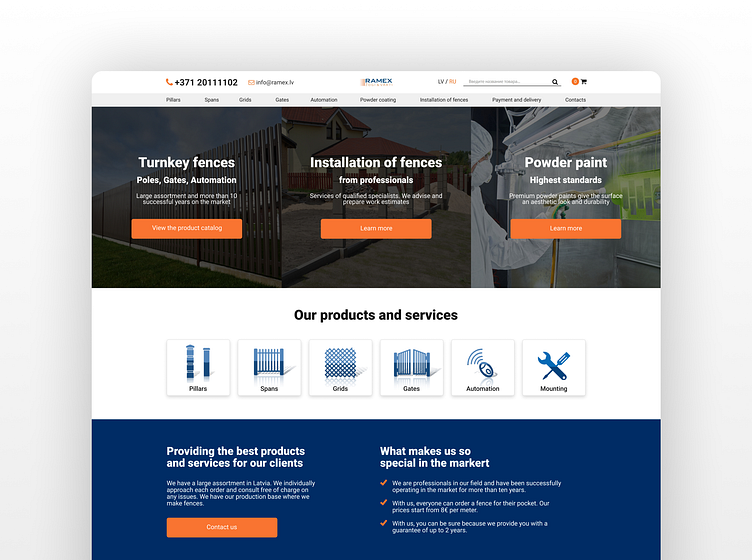
Ramex | eCommerce website design
The intuitive and enjoyable shopping experience
88% of online shoppers say they wouldn't return to the website after having a bad UX experience. While designing Ramex, my main task was to create a great overall user experience for customers visiting the web shop, from opening the page to purchasing goods.
Visit Ramex's website, fully designed by me:
UX Research
My working process started with UX research as it was essential to what am I designing, who is it for and how to make it effective. Firstly I looked at the market to find out similar construction-related e-commerce to highlight their advantages and disadvantages in UX.
After my market analysis, I started researching the target audience, and due to it, I concluded that Ramex's website needs to be highly intuitive and straightforward. My client complained about his previous website as it was too complicated for customers to understand the navigation, and users were struggling to make a purchase which is a big red flag in terms of UX.
Pleasent user experience
While designing the website, I focused on the critical aspects of a good e-commerce website: site speed, navigation, mobile-users experience, how copy and product are portrayed, and customer journey.
To achieve those results, I focused on four key aspects: utility, usability, accessibility and desirability.
Making customers buy products
While designing the website, I always kept the customer in mind to make the website user-centric and intuitive. I prioritised functionality over everything else, and yes, UI in every website is essential, but I had to ensure the user could make a good purchase without destruction.
I also focused on intuitive navigation so users can do what they want on the website without much effort and interruption.
Separate mobile UX
According to research, by 2024, it's predicted that 187.5 million people will shop via their smartphones. That's why designing a separate mobile UX version was essential. Mobile users can quickly get distracted. I tried to create a quick-to-navigate website by cutting off all the unnecessary elements on the mobile version of the website.
Spotting UX mistakes
Once the website was live, I needed to spot the UX mistakes to make improvements; to do so, I posted User Research. I used the Google Analytics tool to define drop-off points, such as where customers are leaving the website and whether they are making it to make a purchase. This information was critical for me to make extra UX adjustments on the website.
Live website for you to see the final result: https://ramex.lv/
Want to Turn Your Ideas into Design?
Email me at resetnikovs.aleks@gmail.com
I am always available for a quick chat over...
Whatsapp +44 7734 236137
Telegram https://t.me/aleksreshetnikov
Follow me on:


