TJ Logo Update
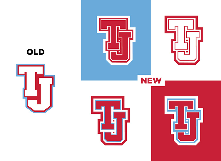
You ever see a logo and just have to fix it?? This logo for a local high school has driven me crazy for years. So I gave it a little update! The fat J and all of the strange dead space between the T and J had to be fixed. I also added a new stroke to help everything feel a bit more balanced. The new letterforms also feel more athletic and clean to me!
Did I make it better or worse?!