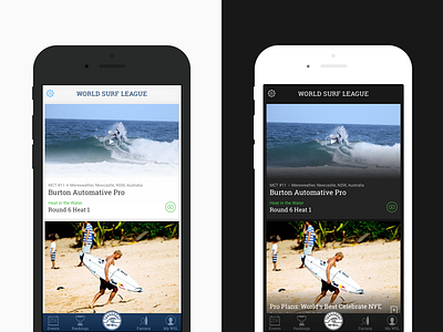
Light & Dark
One of the first design directions was to go "dark" for the home screen experience in the app. We ultimately moved away from that direction to a "light" version that incorporated more of the WSL brand through color.
Although I prefer the final outcome I was still quite fond of the darker version so I thought I'd share it here.
Be sure to check out the full pixels and let me know which one you like best.
More by Adrian Phillips View profile
Like
