Craft Beer Label Design
When first designing the packaged beer experience at Barebottle Brewing, I recognized that a modular design system with the ability to update as things went along was crucial.
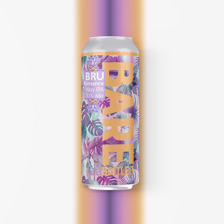
Bru Romance is a great example of my design system.
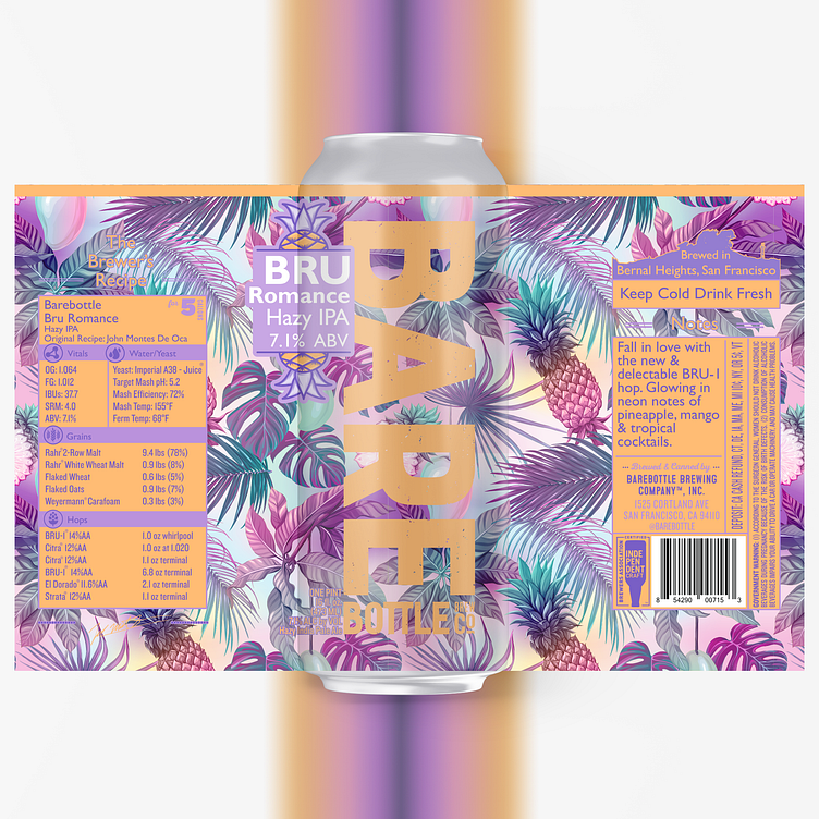
1. The BAREBOTTLE brand mark down the center of the label is unchanging. Otherwise known as the "Monolith Strategy" this large brand mark acts as a beacon on the shelves allowing customers to recognize our beers quickly.
2. The logo of the specific beer. Over the years, I've added to the list of essential info to communicate in the logo. These decisions are based on customer feedback & broader industry feedback. For example, I added the ABV in large secondary text as ABV is quickly becoming a larger decision factor for consumers. This decision is based on recent findings from the Brewer's Association. In this case Bru Romance. Bru is a reference to a specific tasty hop used in this beer & a play off of Bad Romance.
3. The panels: On the left is the Recipe Panel which is constantly updated to reflect the tinkering and experimentation of the brewers. On the right is the Tasting Notes panel with all the legal information along with quick tasting notes.
4. The background artwork is solely focused on communicating the Visual Flavor of the liquid inside.