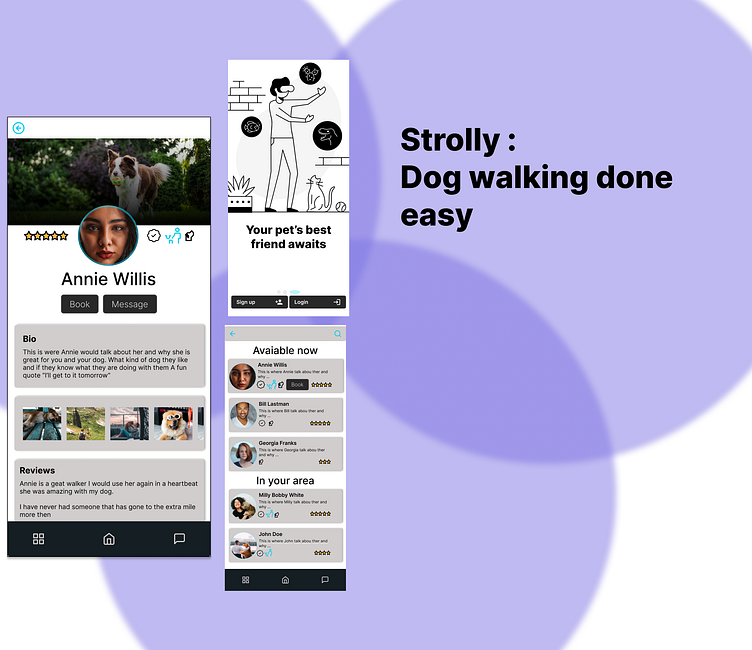
Strolly Dog walking Case Study
This is my case study for the production design class from dribbble. I was the sole person who did this project. I imagined, created, designed and implemented everything for better or worse.
Problem
We faced a problem that dog owners sometimes need help caring for and walking their dogs. Create a service to connect dog owners with dog walkers.
Consider how we can help dog owners trust their dogs are in safe hands.
How do I make mine stand out?
My Fact-Finding Mission
Market Research
There are a lot of other dog walking/ sitting apps out in the marketplace already. I looked at these and tried to figure out what they did well and what I could improve upon.
User Research
After looking at the competition, I decided to do a phone interview with potential clientele, and here are some of the issues and what they would look for in a new dog-walking app.
It was ultimately decided that it need to be easy to use, friendly, and something that people would want to use again and again.
My Process
I first started with pen and paper, I find that easier to just let my mind flow and come up with what I think is a good start and something that I don't mind blowing up if it when it doesn't work. I find it easier for me to keep track of what I have done and what I still need to get done.
I wanted it to be easy to add a booking for a walk from most pages and also that you could get to your messages. This makes it great for the user to want to come back and use it more than once.
User Flow and Wireframing
I went very ambitious when I was first coming up with how I wanted my app to flow. I later decided to make it a little smaller for the case study. I can always go back and make it better later.
Iteration Iteration Iteration
I spent a lot of time trying to figure out what I wanted my app to look like. I thought I wanted to do a dark theme, but after talking with my mentor, I thought it might not be the best idea for the first time. I think that I went through like 4 iterations before I landed on something that I liked.
This was the first onboarding attempt, something I didn’t know about. After a few tries, I got it to something that looks good.
At first I was not sure what I wanted a profile page to look like but after a couple of trial and errors I settled on basic idea. Then it was time to refine the little things. I worked with my mentor and we some changes like the spacing between the buttons, made the blocks rounded, and decided that a dark theme might not be the right way to start out.
Prototyping and Testing
After a testing with a few friend and seeing what other people in my cohort were doing this is what I did for my onboarding flow.
Here is my flow from a returning user making a booking for a walk.
The Outcome
What I learned
For my first time doing anything in Figma, I learned a lot. I started from knowing nothing to having an app's working model. For the first time doing anything like this, I feel I made a good attempt at this. I know there is a lot of work that In needs to do moving forward, but this is a great base.
What I could do better next time
I still need to work on my visual design and keep it consistent throughout the project. When I was working on my project, I wanted to do everything, i.e., I made the project too large for my time constraints, and in the end, I needed to pair it back to ensure that I had a final project to show. I will also need to remember those little things during my next project. For example, the spacing between some elements may be off by a pixel or two, but that adds up when it is compounded a few times. I need to keep having fun and work toward making a great product next time.


