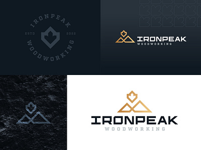
Ironpeak Woodworking Branding
I had the pleasure of creating a logo and brand identity for a good friend. This project combined a few interesting themes that resulted in the finished product.
The mountain icon represents the business name and the rocky mountains.
The maple leaf was incorporated into the logo to represent a Canadian company, but maple hardwood is also the main source of lumber that the business works with.
The "Ironpeak" typeface is also fully custom which provided a unique learning experience during this project.
More by Logan Ludwig View profile
Like
