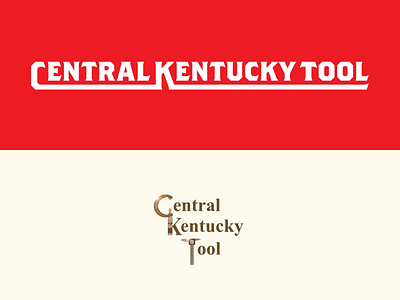
From The Archives - Central Kentucky Tool
Wow. Posting this one not so much for the final design (top), which is from early in my design days, but for the comedy in that old logo. That is actually what the brand was using before I was hired for the redesign. You should have seen their website.
This is part of a series. I'll be digging up old work (good, bad and ugly) to share. As designers, we often spend our time looking to the future and hiding the less-than-glamorous projects from our past. Judgment aside, it's more fun to share.
More by Jake Stephenson View profile
Like
