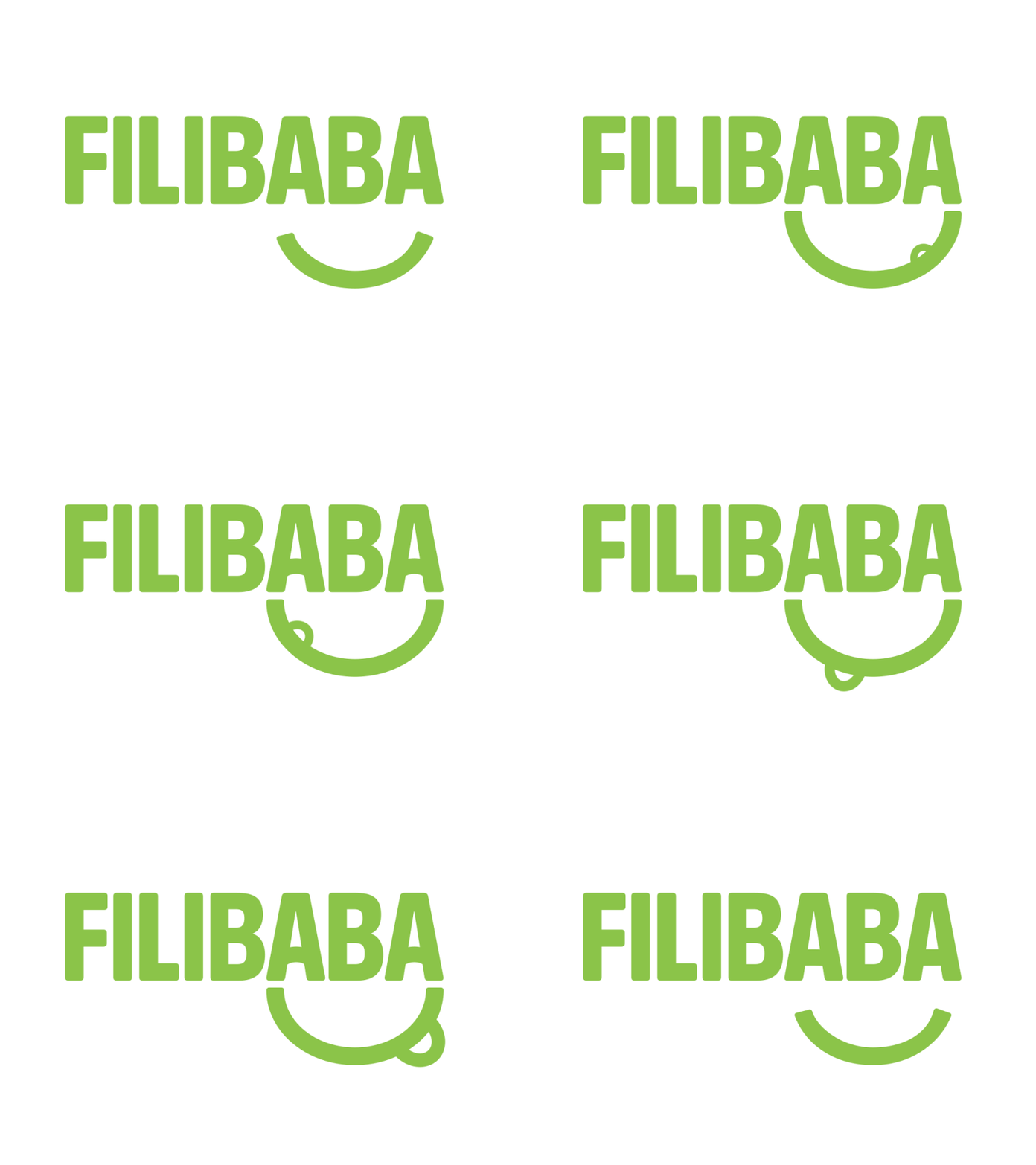
Filibaba Logo Redux
I've revisited Filibaba's logotype in an effort to refine it. I wanted a slightly more geometrical look, while keeping the friendly appearance. I realized while sketching in uppercase that the double A's were a better fit for the eyes, which also gives the mouth a better placement at the end of the word mark. This also means you can simply remove the lettering to reveal a smiley face, which is the complementary avatar look (see Filibaba's avatar here on Dribbble).
Thoughts? Any feedback is appreciated.
Filibaba inspires people around the globe to cook eco-friendly, ethical and healthy food with its line of vegetarian cooking apps, and you can try Veggie Weekend for free: https://itunes.apple.com/us/app/veggie-weekend/id625161325
More by Filibaba View profile
Like

