Rising Sun & Co
December 2010
--
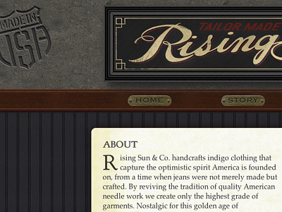
This is a favorite of my early product designs, created for a turn-of-the-century style denim tailors Rising Sun & Co. At the time I was also managing their retail and overseeing production. The site's design mimicked the old-world haberdashery and denim workshop.
This was at a time when skeuomorphic design was at a peak, and, I think not by coincidence, the year responsive web design launched as a concept.
I think it's no coincidence that responsive design was slow to become a priority while skeuomorphism was peaking—people had to stop designing to the pixel, and rather approach things with fluidity in mind.
The wood panel background was a replica of the wainscot found in clothing shop's interior, the masthead was modeled after the same sign that adorned the outside of the building, and the brass plates were an homage to those on each of the decades-old sewing machines in the back of the shop, where all of the clothing was manufactured.
Besides successfully crafting a responsive site with such graphic heavy elements, one of my favorite facets was the drop cap.


