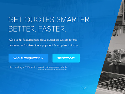
AutoQuotes Homepage Design
We used the same colors and gradient throughout the site to neatly tie the branding together. To avoid creating a somber website experience, we livened up the banner with a gradient overlay for a more welcoming feel. The typography used throughout the site is very clean and modern; letting the imagery and content speak for itself. I also created a custom icon set for each user to add personality to the site.
More by Station Four View profile
Like

