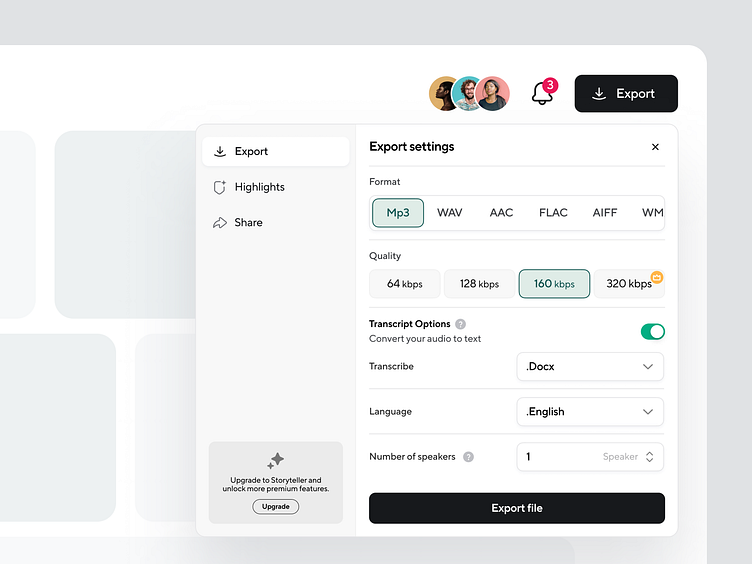
Podcastle Export Pop-up
Hello everyone👋
Here is the Export popup re-design for my current project Podcastle
Let me tell you a short brief about this export popup design. It has two sections, the Sidebar and the Content.
I used an accordion-style approach in the sidebar to add more buttons based on product needs. At the same time, this layout is clean and functional.
The content section is more dynamic, we are rendering based on the button clicked from the sidebar, so the content has more dynamic data.
Most of my solution was based on minimal design, functionality extendable and serve only first what the user needs it most. This export popup we have with a little more futurist, The most asked question was WHAT IF, WE ADD THIS IN FUTURE, that’s the reason I found the approach is more scalable. So we can add more layouts as we want.
