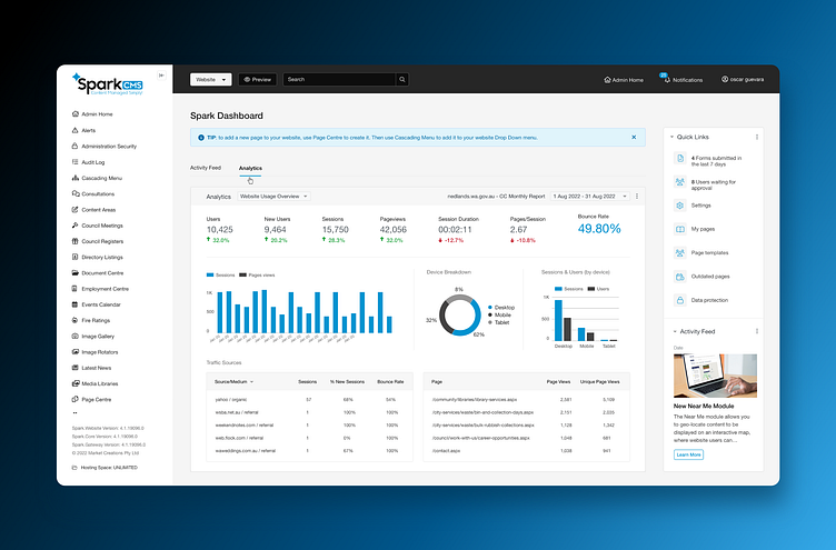
Spark CMS Redesign
My Role
UX/UI Design
Bench market research
Desktop research
End user insights and workshops
Using the new brand identity to create the UI
Adapting design for various devices and cross-platform requirements
Wireframes
High-fidelity and visual design
Providing support during the development process
About Spark CMS
Over 500 websites have been deployed using Spark CMS to date. Over 100 of these sites are dedicated to local government authorities in Western Australia.
The Challenge
The user interface was outdated and not responsive compared to the market, and the design did not reflect the new brand identity. Also, the users found the interface hard to navigate and overwhelming.
Goal
The team and I sought to address these issues by designing a platform that would consider the needs of all users by improving the user experience and the interface making it more intuitive, friendly and accessible.
Product Scope
The CMS has been designed based on the user's feedback, research, and the competitor's analysis, ensuring improved product accessibility and an easy-to-use platform designed in consultation with the end user in mind.
User-centred interface
Over the course of this project, I have created different application screens, ensuring the product is comprehensive, efficient, and user-friendly. I have focused on creating an intuitive user interface that would improve the overall experience for people interacting with the CMS product. The team has put a lot of effort into testing and iterating on the design to guarantee the final result meets the expectations of the end-users.
Responsive User Interface
The website administrators have the freedom to create and edit templates via HTML and CSS with the template manager. The Spark CMS gives complete control over the website templates.


