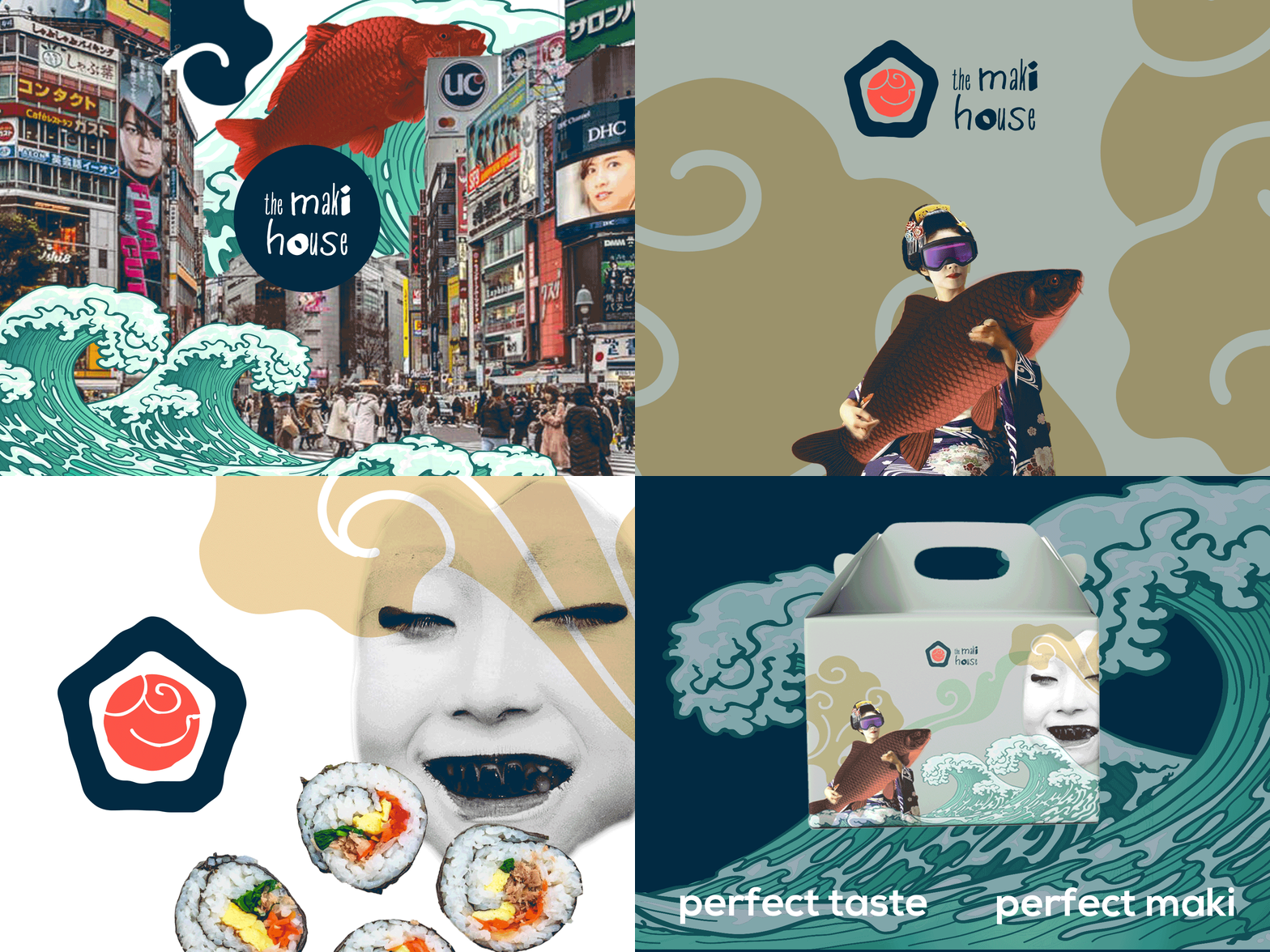
Branding concept The Maki House
Branding concept The Maki House, the best sushi in town.
The logotype represents a hand-drawn house-"maki" with the fish texture referencing the traditional Japanese illustration element. The package is a paper box with geisha and fish as main characters to build a connection to the country of origin. I wanted some fun and surreal for the new branding.
Like what you see and needs some branding? Hire me 😀
More by Yanina Utemova View profile
Like
