Shine a light on Just Rain
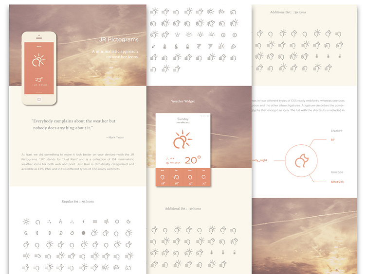
aka a presentation I've put together some time ago for an icon set called Just Rain, which I did also some time ago It was and still is one of the icon sets and presentations I feel sort of comfortable with. Usually I start to hate my work after some days....
This is a sort of one pager I did for Behance back then and today I basically wanted to shine a light on this project, in sort of a throwback shot, I hope you don't mind it. If you're interested in these icons, there is a link right next to the shot - and if you want to browse it on Behance, here you go: http://on.be.net/1cvLPJ0
As for the presentation: Basically some illustrated MockUps, so not actual UI design, but just something to show how the icons would incorporate in such a digital habitat. It's mixed with some pctures I have taken on a ride on the Autobahn (don't try this at home) and some color play.
Thank you for your time and attention.
