eCommerce hero optimization
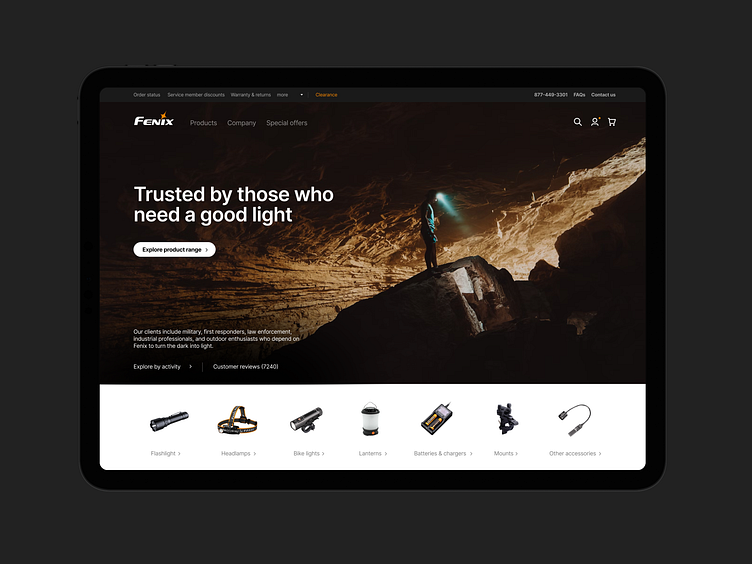
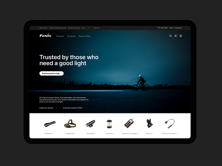
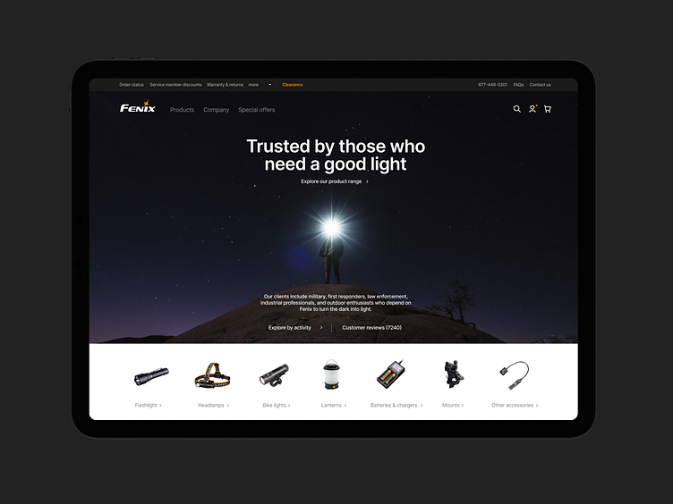
I recently spent a bit of time debating image, copy, CTA for an eCommerce homepage redesign project. I tried to use another similar website to show what I'd suggest. So I designed a suggestion I'd make to improve the fenix-store.com homepage hero. It's heavily inspired by DJI/apple/B&H while still featuring the core elements of Fenix. I cut down and rearranged a bunch of stuff to make the UI more aligned with what I deem to be more modern standards.
As I noodled on the topic, here are a couple personal opinions/notes :
• Generally speaking if a ecommerce site as a range of product with less that a dozen categories, I like to show them right below the hero, ideally above the fold.
• No product carousel - way too heavy and even if well executed it take a lot of
effort to maintain to craft the right assets (not everyone can do what dji does).
• Cart/search/account belong in the top right. With shopify and a few big name having adopted littery this convention, it seems safe to say that most ecommerce platform have version of this UI (sometimes with labels)
• A large aspirational image leaving a lot of room for the headline and creating some visual breathing room feel good to my eye and break the convention of the super cluttered salesy ecommerce. Since not everyone has apple level product photography I think keeping the image aspirational is good enough since the category cards are right below.
• Left align feels better to my eye but centered is more splashy. It's an eternal debate. The image choice or copy length/rag often ends up dictating the alignment.
---
I made this design to avoid being confrontational with the client and be able to still make a point without making him feel like I was forcing my perspective.
...my strategy didn't really work but I wanted to put this comp and few notes here
🚵♂️