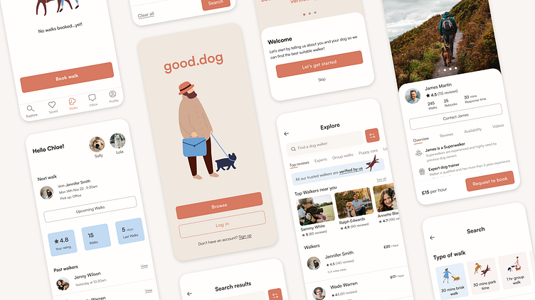
Good.dog - Dog Walking App
Good.dog is a dog walking app as part of the Dribbble’s Product Design course.
The app offers busy dog owners a quick and easy way to find verified and trusted walkers.
Problem
Busy dog owners want to provide the best walking service for their dogs while they are away at work.
Goal
Create a trusted and simple app to help connect dog owners and the best dog walkers.
My role
My role on the project was to conduct user research to discover the pain points, and from those findings, design and build the solution mobile app.
I was part of a small cohort where we shared our work and provided feedback to each other weekly. A massive shout out to our mentor Joel for his support!
1. Research
The first step was to define the problem our potential users were facing to help with Good.dog's business goals.
Four dog owners were interviewed to discover their pain points - here are the key highlights from my findings;
Trustability
One of the main issues our cohort faced was building trust through an app. So we had a brainstorming session on how we can design trust in various ways.
The next step was to define the user persona based on all the information gathered.
And with user persona defined, key gain points were highlighted to address in the design.
2. Ideate
User flows & Wireframes
As the user persona didn't have a lot of time on her hands, the app had to be familiar and easy to use.
Features such as saving favourites, personalised dashboard and adding information up front about their dogs helps provide a more tailored and quick experience.
The wireframes help test and validate the ideas for possible solutions, with the focus on a clean and functional design.
3. Design & Iterate
Following the discovery phase, the key attributes for the app were trustworthiness, reliable, clean and intuitive.
The typography, colours and other visual elements were chosen to portray a clean and professional feel with a touch of friendly.
Changes to visual design
Throughout the design process, feedback was gathered from potential users and from my cohort, and changes were made along the way to ensure the design was clear and balanced.
Designing trust
Various elements such as badges, reviews, endorsements and language were incorporated to help solve the issue around trustability.
Design system
Components and style system helped provide consistency and speed.
4. Prototype and test
The design was tested by two dog owners with the task to search, view a walker's profile and book a walk.
Both users were able to complete the task and overall felt the process was familiar and easy to follow.
They also gave some suggestions to change including;
Clearer CTA wording when viewing booking summary and sending request - ‘request to book’ was changed to ‘send request’
Bigger padding in certain buttons to improve accessibility
One user also quoted the following after completing the task;
5. Refine and deliver
Video shows final version of the the prototype:
Outcome & results
Creating my first app was a really rewarding experience!
Throughout the process, I learnt to gather insights, seek feedback and design from it. I enjoyed refining the design to ensure it had the best user's experience as possible.
It was great to hear users felt my design could be trusted and intuitive.
I look forward to designing more products!
Thank you!


