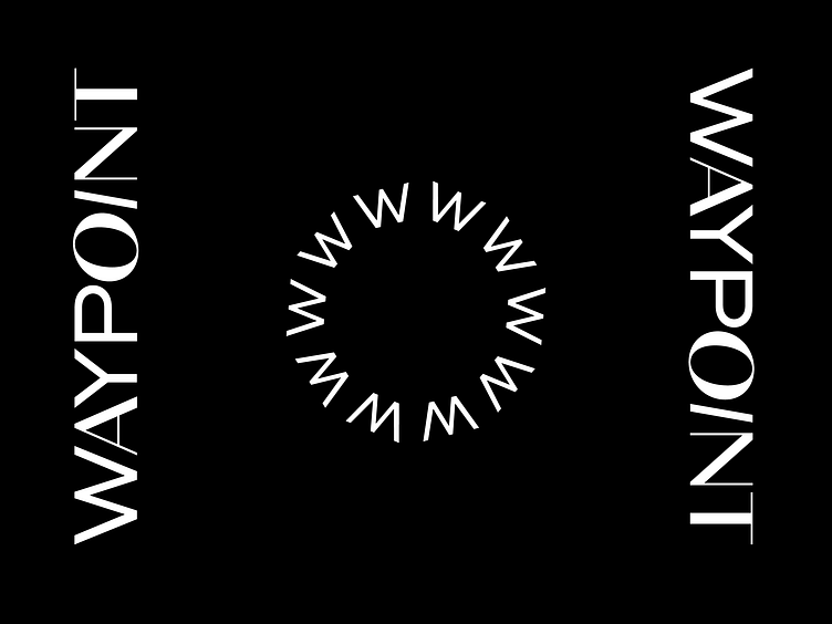
Waypoint Logo Mark
A short exercise I did for a marketing company. This was an unused logo I really liked that I did for a client. It ultimately wasn't right for this client, but I wanted to play around with it this morning. I think it has potential. I loved how the different letterforms come together but still feel cohesive. One of their keywords was community so I felt like this was a strong indicator of this. Right now I'm just playing around with black and white but excited about bringing in colors and other elements.
More by Kevin Craft View profile
Like
