Spending Analysis — Inspired by Apple
Intro
Personal finance is a topic that has been on my mind for a while now because of a work project. I did a lot of research around personal finance apps and features such as spending analysis and budgets.
But, surprisingly, the inspiration for this concept came from an apparently unrelated source. The Apple Health iOS app and specifically the Steps count functionality (screenshots below).
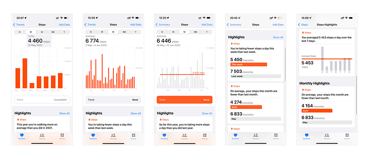
As a regular user of this app and feature, I slowly started to form an idea over time: how would this look like if it tracked user's money spending instead of steps?
So I redesigned those Apple screens to bring this idea to life.
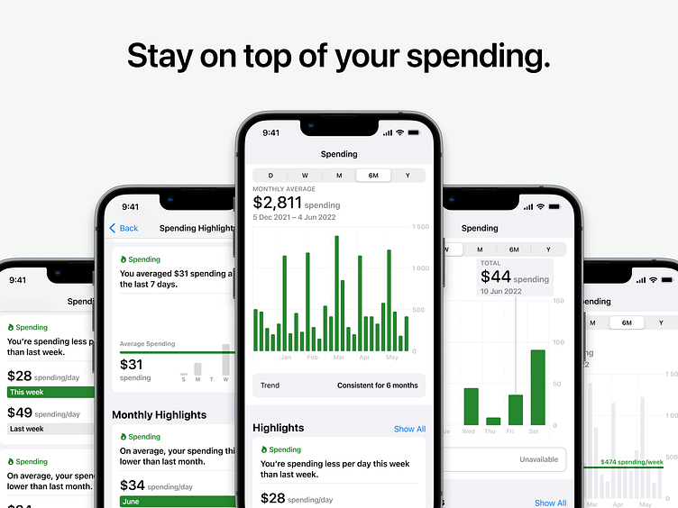
Spending Over Time
In the main screen, users can filter their spending by five different time periods (daily, weekly, monthly, half-yearly and yearly) and visualize it in a corresponding bar chart.
From left to right:
Checking spending on a specific day of the week
Seeing total spending over one month
Visualizing the spending trend over a period of six months (average spending per week)
Checking the monthly average spending over a one year period
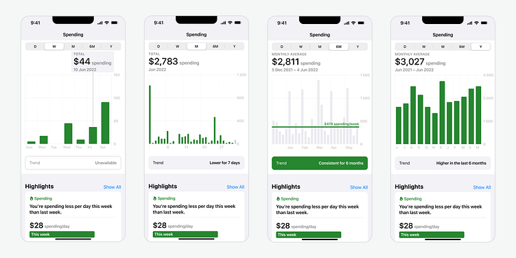
Spending Highlights
Below the bar chart in the main screen, users can see the most important spending highlights. By clicking 'Show All' opposite to the section title, they will be able to see all available highlights over different time periods (daily, weekly, monthly and yearly).
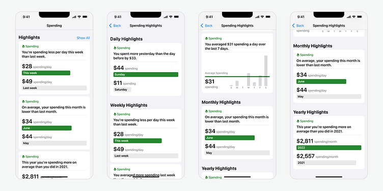
From left to right:
Seeing some spending highlights below the chart
Checking all spending highlights (top of the screen)
Checking all spending highlights (after scrolling down)
Checking all spending highlights (bottom of the screen)
Final Prototype
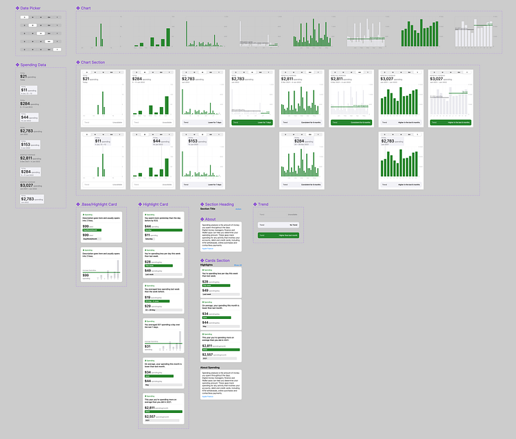
Local Components
An overview of all local components built in Figma and used to design the screens.