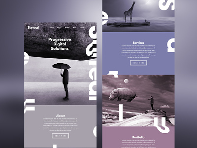
Surreal Website
Here is the initial development for the Surreal website. Developing the secondary colour palette and using negative space to portray a clean yet 'surreal' experience, especially with the letters coming off from the identity down the layout. This is at it's early stages so any feedback is more than welcome.
See the design attached.
STUDIOJQ Do not own the rights to any of the images used and this is just a concept design project.
More by MadeByStudioJQ View profile
Like


