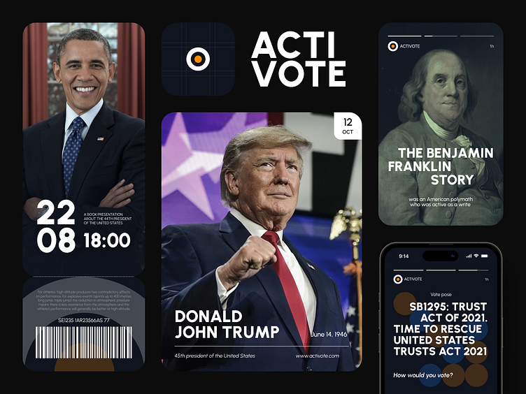
Voting mobile app, candidates section | Lazarev.
🌹 If you were the Bachelor, how would you pick those who get a rose?
Now hold up there for a second, don’t accuse us of lookism. Better look at how neatly did we redo the candidates’ section in ActiVote, a mobile social app that empowers U.S. citizens to take a more proactive role in their country’s politics.
Lazarev.agency’s mission was to renovate the app’s aesthetics completely. One of the key sectors to rethink was official’s profiles. By default, each elected official (like the president or senators) has a dedicated page where the user can view essential information; it’s also possible to stay up-to-date on what they are doing in the office.
What Lazarev.agency did was rethink the official’s screens layout. In the preview, we placed a person’s picture, while their profile now looks much more seamless than the old design version. The first elements striking attention here are the official’s picture, their name, and color, which is not just about a bright accent but also a sign of the official’s relevant party. Like before, the end of the page finishes with a call-to-action, whether the user would vote for them, - but now, this button is redone with brighter and clearer UI, dark background, and additional volume.
Read more about the ActiVote case and choose wisely 💐 and, maybe, give us a rose too? hello@lazarev.agency
WE APPRECIATE YOUR INTEREST,
DRIBBBLERS! 🤩
If that looks like something you’d collaborate on, hit us back
with your business inquiry at hello@lazarev.agency
Lazarev. site | Behance | LinkedIn | Facebook | Instagram
