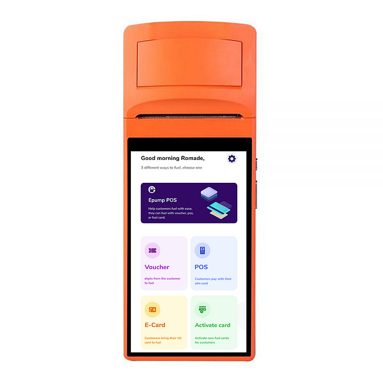
POS App redesign for station attendant
As part of my user research for the redesign of our fuel attendant POS app, I ran research on how they interact with the app. I found out that they prefer the buttons big with different colors so as to help differentiate the various actions to take. The aim is to make the process faster and easier to use.
More by Olaitan akinlade View profile
Like
