Design UI for packaging company
Hi Guys!
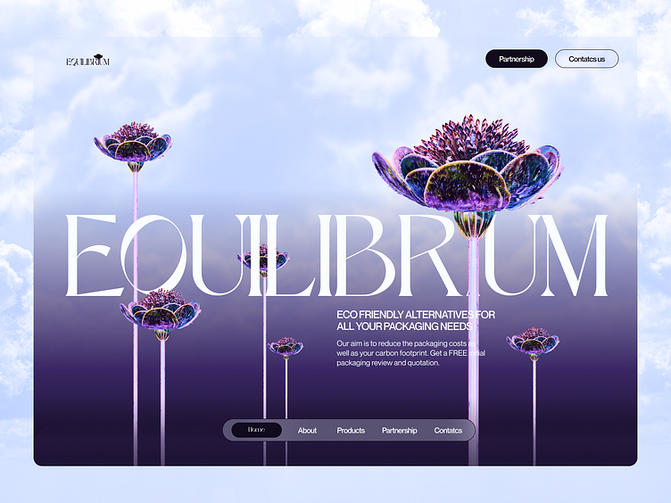
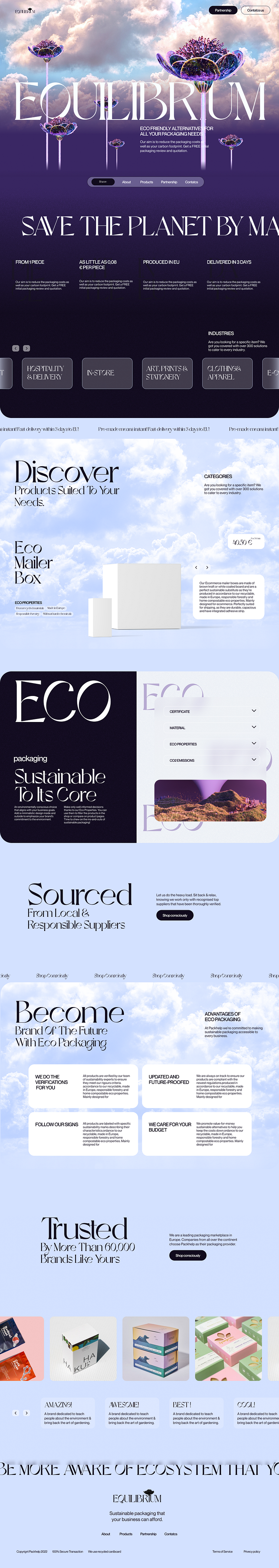
So here you go, second part this case study. For today you can see in all details full landing page and more shots of hero section with different background. Hope you'll like it! Tomorrow I'll show you mobile version and also branding and explain idea behind this design, so stay with me an follow !
Press "Like" if you like it 💖
Have any feedback?
Feel free to share, your feedback will be highly appreciated!
Stay with me in Dribble or Behance
If you would like to order my services, please contact me
My email darinayefymova@gmail.com
So, for this Eco brand packaging I want to emphasize the idea of technological influence on natural world. As we developing , more eco systems are being destroyed, these flowers they are not real, they human made, fake. So main point to show that we should make all possible to safe nature and make right business decisions to save nature as we see it now and create new way to make packaging, transportation and all aspects of businesses more eco-friendly than we have them now. For this reason, I used so unusual colors for eco brand, to make accent at fake flowers more visible. Hope you´ll like the explanation. I´ll only try to make some nice work and hope you´ll like it. Even if you don't, I always appreciate your opinion about my work.

Press "Like" if you like it 💖 and follor to see more!