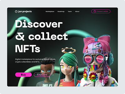
NFT Marketplace Hero Section
After watching Relume's Design League Match 1 between Sergey from Finsweet and Fons Mans I was inspired to play around with an awesome technique I saw during the match.
I was blown away at seeing Sergey create the 3D pipe using the pen tool along with some clever use of layering, gradients and layer blur that I wanted to try it myself.
The placement of the curved lines draws the eye from the top left of the screen, heading to the logo, the headline, down to the Clone X NFTs and then touching on the CTA buttons.
This was my first time designing a dark theme. Although I followed along with how Sergey created the 3D curved lines I didn't want to use the same colour scheme or recreate the same design as he did.
I drew inspiration from vaporwave art styles for the colours going for a minty neon green for the 3D lines and a punchy pink for the CTA.
I opted to go for an F-pattern arrangement of the headline, subheadline and CTA buttons to allow for the content to be easily read.
I aimed to keep the overall layout of the hero section consistent with common web patterns.
I feel overall I was able to create a design that is accessible, and full of intent and purpose while achieving a great visual design for any NFT-related project.
I had fun with this personal project exploring new design techniques.
Let me know what you think.
