Booking System App
Recently, I've been researching how CRMs are created and work.
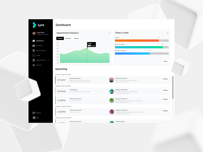
Here's one of my ideas - the "Lyra" dashboard- the next step from one of my recent commercial projects. That's how the modern CRM should look.
High contrast, readability, and a well-planned hierarchy of elements make it a great-looking tool. A tool that people can use and enjoy daily.
Let me know what do you think about this design 🙂
We’re ready for new challenges!
Send us a message: hello@redvike.com
Don’t forget to visit our website: https://redvike.com/
Client reviews on cooperation: https://clutch.co/profile/redvike
〰️〰️〰️〰️〰️〰️〰️
Press “L” if you like it!
Want to see more projects? Visit our profile and remember to follow us!
More by Redvike View profile
Like
