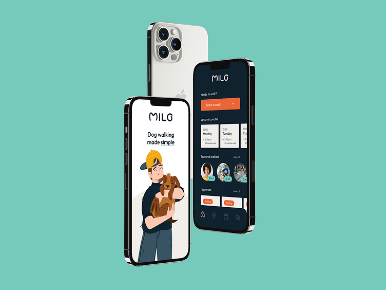
Milo - The Dog Walking App that makes booking simple
Overview
Milo is a dog walking app, focusing on matching each dog to the right dog walker. This app concept was developed as a part of Dribbble’s Product Design course. For this project, I acted as the Creative Director of the application, taking this brief from the drawing board to a full prototype.
To start, I conducted a market analysis as well as doing user research. Findings during this phase helped me to create an effective user flow that guided my low-fidelity wireframes. Following the planning, I updated the design, translating the sketches to high-fidelity wireframes to create the visual design of the application. Finally, the app was prototyped to give a better idea of it should function for its users.
Creative Brief
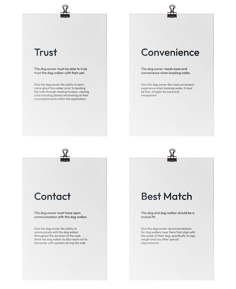
Nearly 1 in 5 American households adopted a dog amidst the Covid-19 pandemic, and now as life resumes to our new normal, people are returning to work and their dogs are left needing additional daytime care. Being a dog owner requires some additional help sometimes, and a dog walking service may be just that. The challenge was to create an application that connects dog owners with dog walkers in their area. But don't forget to consider the ease, efficiency and most importantly, trust that dog owners must have to use a service like this reassuring them their pet is in safe hands.
Problems
Dog owners find it difficult to first, find someone they can trust to come pick up their dog and take them on walks. It is also a struggle to coordinate the details of pick up and drop off. Other problems included easy contact with the walker as well as making sure the walker is the best fit for the dog.
Market Research
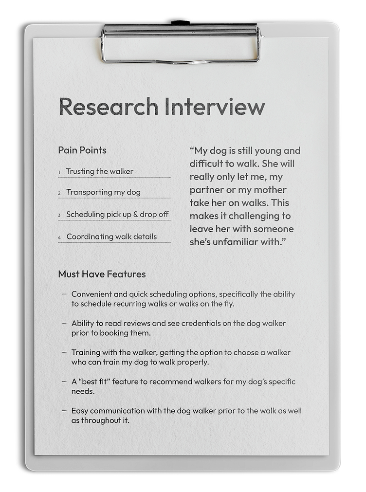
Research was conducted through interviewing real dog owners to see the pain points they have with dog walking apps currently on the market. After conducting research, it became apparent that the #1 concern of dog owners was knowing they can trust a dog walker with their pet.
Personas
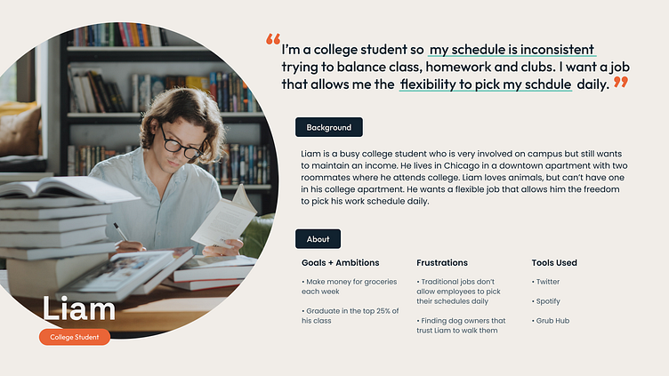
A problem I noticed during the market research phase was that all of the dog walking apps focused primarily on the experience of the dog owner, which is key, but it was neglecting another large demographic of the app’s users, the dog walkers. I felt it was necessary to not only create a user persona for the dog owner, but also for the dog walker and the goals and frustrations they may be experiencing.

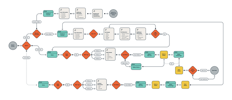
User Flow
Below is the user flow designed to show how different users will navigate through the application. A couple key improvements I made based on my market research was first, as perviously mentioned, adding a flow for new users who downloaded the app to become dog walkers.
The second improvement was allowing a user to bypass “create an account” and get into the application to explore what it has to offer. A personal pain point I found was creating an account on an app only to get into it and realize what it offers isn’t what I was looking for. To solve this problem, on the “create an account” page I added a secondary button allowing a user to select “just looking” and they will skip directly to the map where they will enter their zip code and see what dog walkers are located near them.
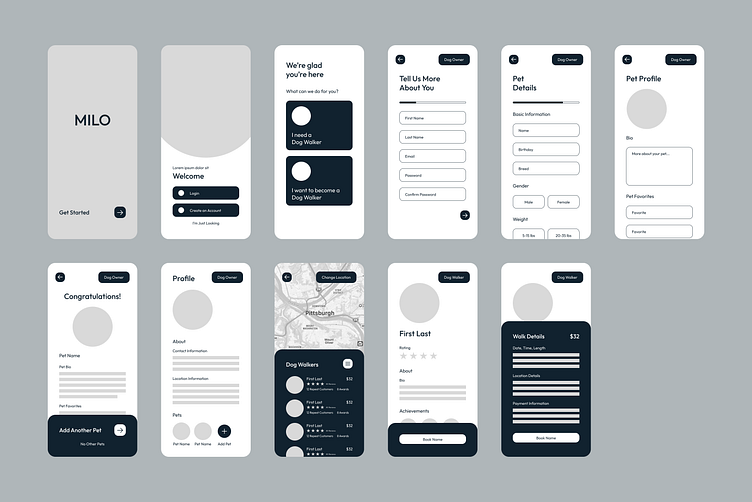
Wireframes
Below are the initial wireframes I created based off the user flow. During this phase, I was able to determine what screens could be combined and what others needed to be added to make the flow function more efficiently. This stage also helped me to see all the frames that needed to be designed for a successful prototype.
Visual Designs
When designing this brand I wanted it to feel friendly, while also appealing to a wide range of audiences through a gender-neutral color scheme and font pairings.
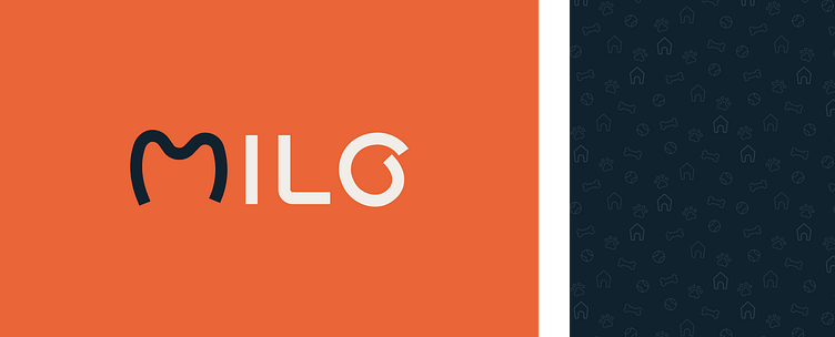
Logo + Pattern
The logo is simple and easy to read, but has a subtle nod to dogs through the shape of "M". It feels very approachable with the clean lines of the logo, but it doesn't appear stiff with the mix of hard and soft edges in the letters. The "O" also plays into the approachability with a subtle hand-drawn look, while still having precise corners.
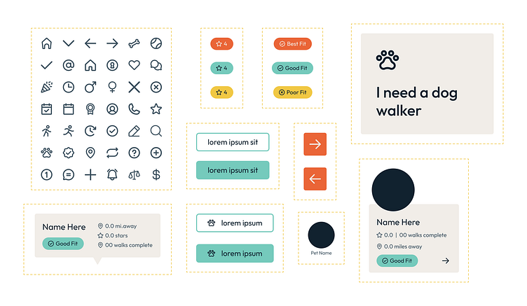
The pattern developed for the brand brings together a variety of the hollow icons used throughout the brand. The icons chosen for the pattern includes the most common items associated with dogs.
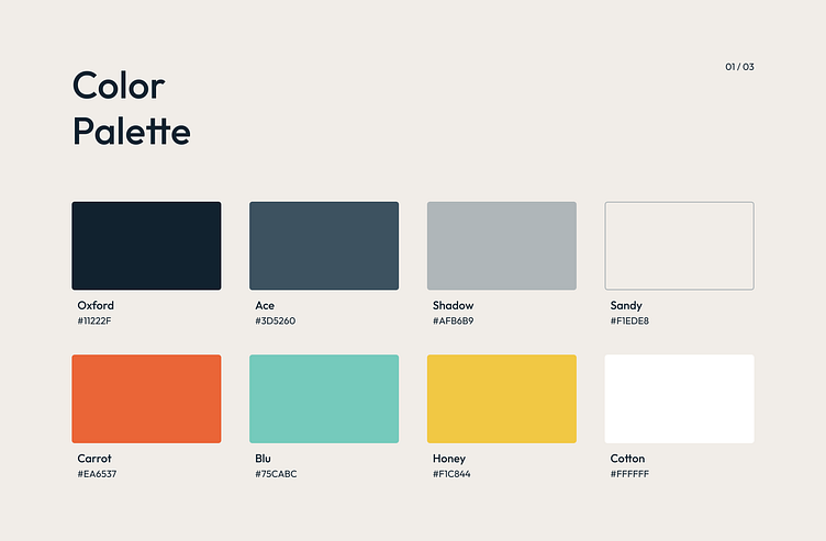
Brand Identity
Again, I wanted the brand to feel approachable and modern, thus the palette. The main color is shades of navy contrasted with a light sand color. The primary palette was then paired against vibrant secondary colors. The color palette overall feels bright and warm.
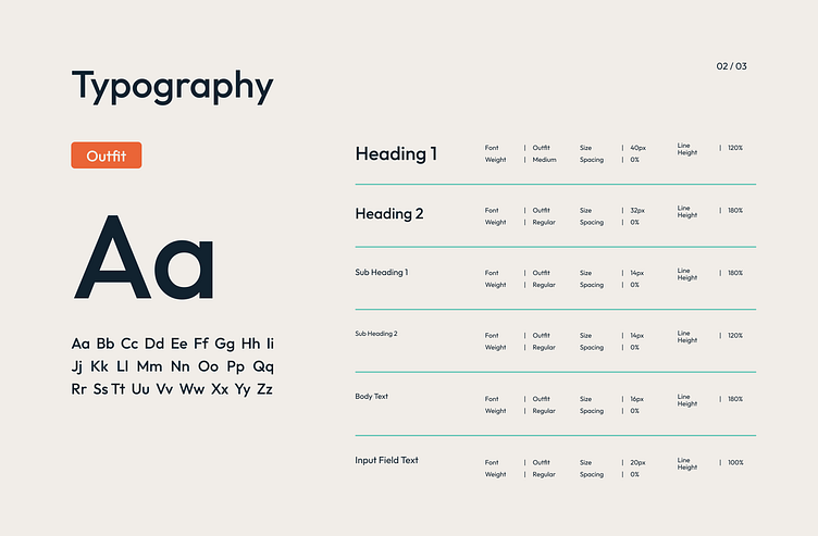
The font family was selected because of its modern look. It’s sans serif with a variety of weights, which allowed for contrast between headings, sub heads, body text, etc.
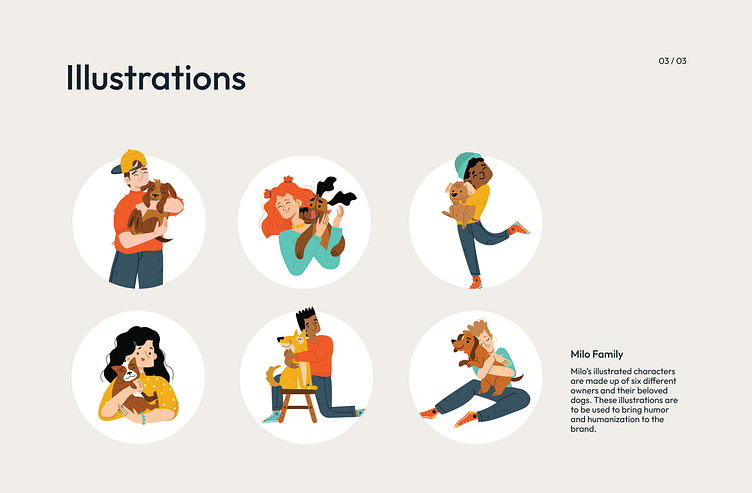
Finally, illustrations were used instead of photos again for a welcoming feeling overall. Cartoon illustrations often read more approachable, and again appeal to many audiences. The use of illustrations over photos also allows the user to visualize themself or their pet in the cartoon.
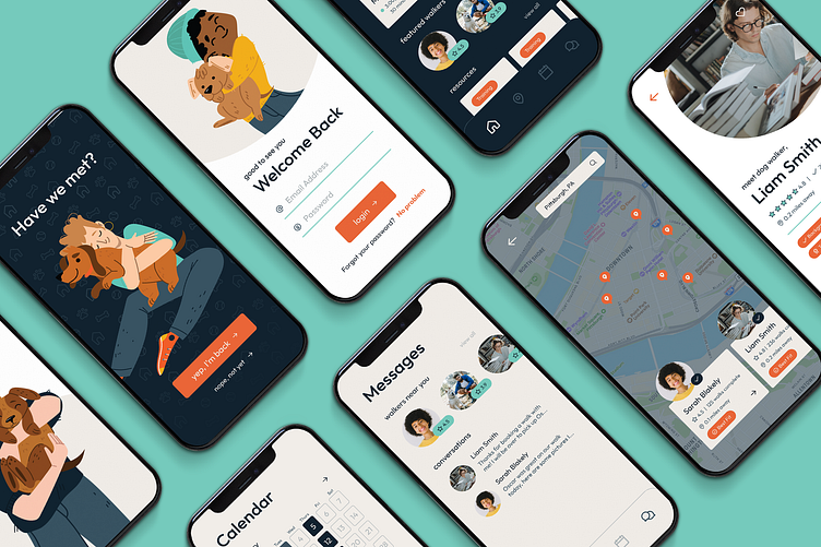
Prototype + Test
Check out the live prototype here!
Outcome + Result
Working on this creative brief pushed me a lot in my experience and knowledge of product design. Having a background in graphic design, I felt very comfortable with the visual aspect of the different screens and the overall brand development. However, I was challenged when it came to taking the pain points found during user research and attempting to solve them in the user flow and then the wireframes.
I learned a lot when it came to creating the wireframes. I felt challenged during the low-fidelity phase because I found myself too focused on the design neglecting the actual function of each screen. I often reminded myself that the design aspect came later, and I needed to first solve the problem. Overall, I felt this brief was challenging in all the best ways and I think the result came out relatively successfully.
