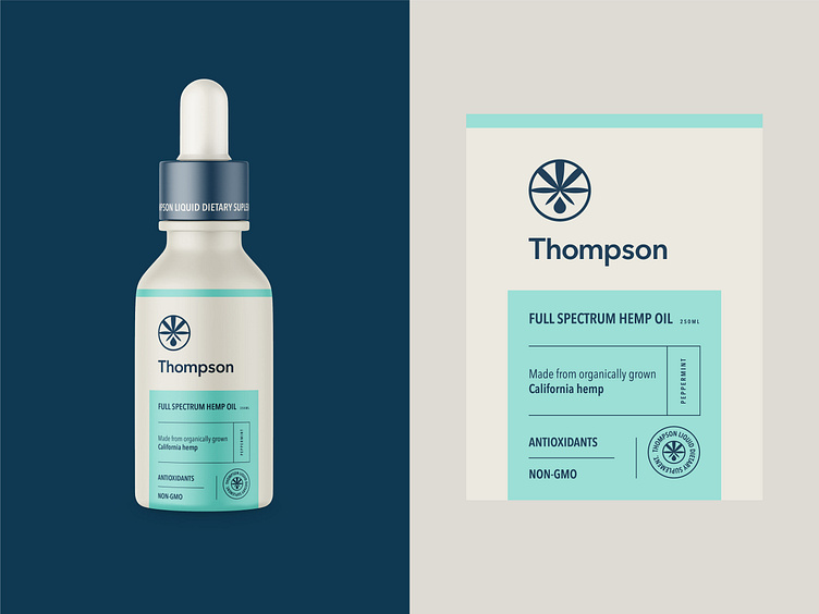
CBD / Branding & Packaging Design for Thompson
Let's work together!
— Do you have a project? 📩 projects@markaworks.com
— Visit our website to see all the project presentations.
🖥 MarkaWorks.com 📱 instagram.com/MarkaWorks
Is it comprehensible that this product is hemp oil by just looking at the emblem🧐?
It is important for the viewers to comprehend the message the brand wants to send in 3 seconds👀. That is how fast people make decisions about the product🏃🏻. For this reason, as graphic designers, we must give viewers the right first impression.
However, it is impossible to satisfy everyone with a specific design due to different views on perfection🤓. At the same time, we are able to draw everyone’s attention with a minimal and sophisticated design. This type of design includes only important information❕ that is aesthetically placed in a minimal layout.
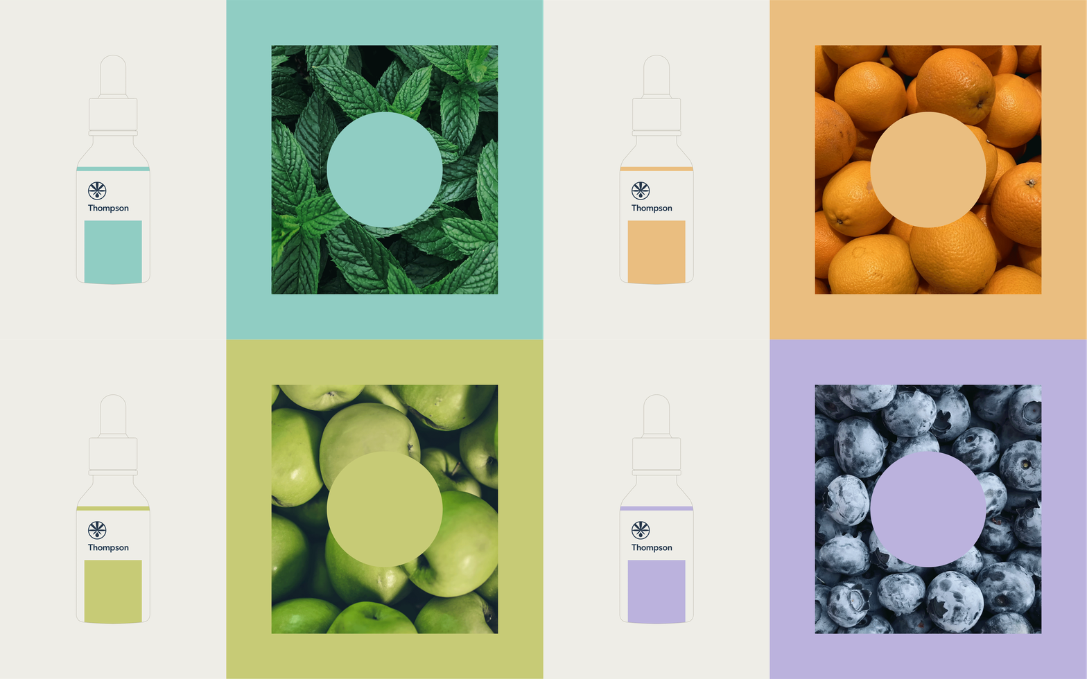
Keeping design minimal doesn’t mean we can’t use some colors🎨. For the Thompson, we used pastel colours, placed the information layout, and drew a line to balance the empty space and the rest of the label⚖️.


