Branding & UI Design for ShitPapers
Shitpapers was founded with the intention of promoting environmental protection and sustainability.
The papers were exclusively made by elephant dung in order to emphasise on the environment friendliness that the brand strives to achieve.
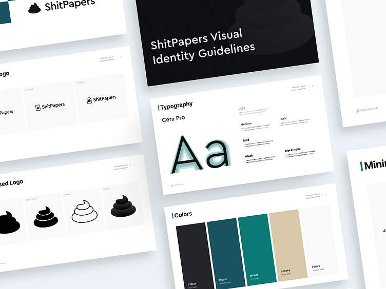
In terms of the branding concept, several variations were tried before settling on a finalized logo and Option 3 was chosen as a result.
The logo features a shit symbol next to the brand name which is made up of the Cera Pro font family
In terms of variations there are 2 ways in which the logo can be utilised. One is a horizontal version with the symbol on the left side, and the other is a centered version with the symbol on top.
The website UI has been built on a Shopify based ecommerce site in order to give it a premium feel. Furthermore it has been designed with the purpose of easing the customer journey. The design was created with aid of the team led by Ryan Comester of Creativehub.


