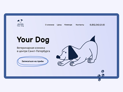
Landing page concept for preventive veterinary center "Your Dog"
As many people feel stressed when they have to visit veterinarian with their pets, I decided to create something positive. So I used simple and funny illustrations, hand-drawn elements like arrows and paws. Also CTA-button has pencil-drawn stroke to support the style. And I also wanted not to use tipical "medical" colours, that the site could be light, clear and remarkable among other clinics on the market. I wanted it to be user-frendly, understandable and simple navigated.
More by Evgenia Kolmagorova View profile
Like
