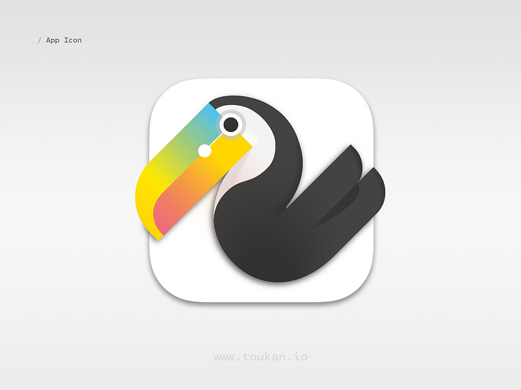
Designing App Icon
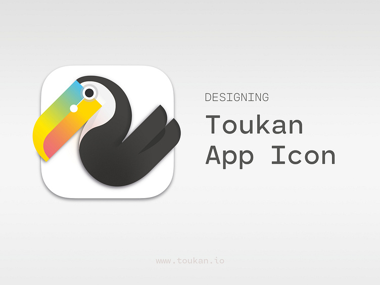
Toukan logo was designed by Blaise Daures, a graphic designer from Toulouse in France.
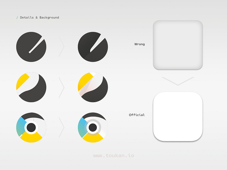
From the beginning, the plan was to figure out a design that can be used both as a company logo and app icon. The focus was put on simplicity to ensure the image scaled well at small sizes, while still retaining aliveness and vibrancy at large sizes.
*
Toukan is a vector graphics editor that makes generative design accessible to every designer. You can use it to create unique pattern, background and artwork, without coding or learning complex and expensive 3D softwares.
👋 Visit toukan.io to get early access
🐾 Join us on Dribbble, Twitter and Instagram
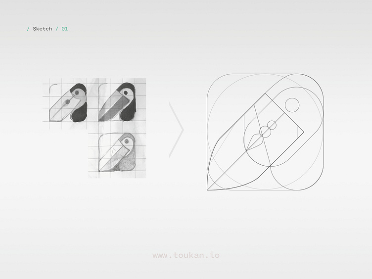
Initial sketches were exploring more explicit icon designs. For instance, coming up with imagery to evoke replication that is the essence of generative design in the app… or using a feather as metaphor for drawing tools.
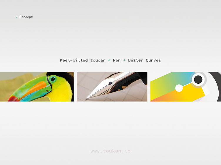
After a few sketches that were promising but lacking impact and clarity, we decided to go through a different path and create an iconic figure that doesn't attempt to convey what the app is doing explicitly. The focus went into finding the right toucan specie as source of inspiration and coming up with subtle metaphors based on Bézier curve editing. For example, designing a beak analog to an ink pen.
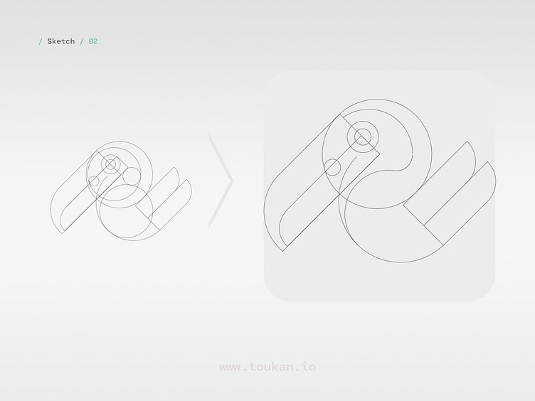
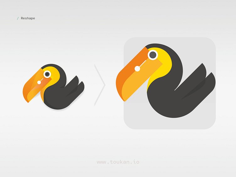
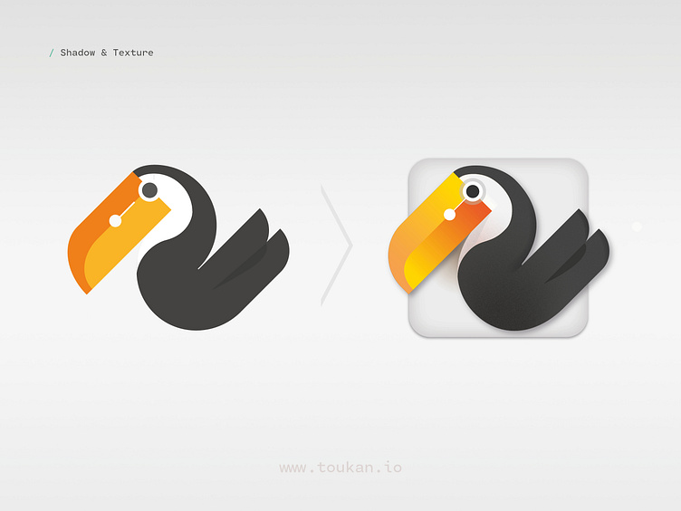
The goal was to come up with a memorable and abstract bird image, that balances geometrical aspects reminiscent of pattern design with a more fluid body recalling hand-made illustration. It's a play with bright colors contrasting against a black and white body. The body volume comes from combining various shadows with a subtle grain texture.
The beak was the hardest part to design, it's intended to recall the pen tool, corner stone of most vector graphics editors. A line connects the hole in the beak to the eye, representing a Bézier curve control point with a half tangent passing through it. Numerous beak variations were tested to figure out the right shape, position and color scheme.
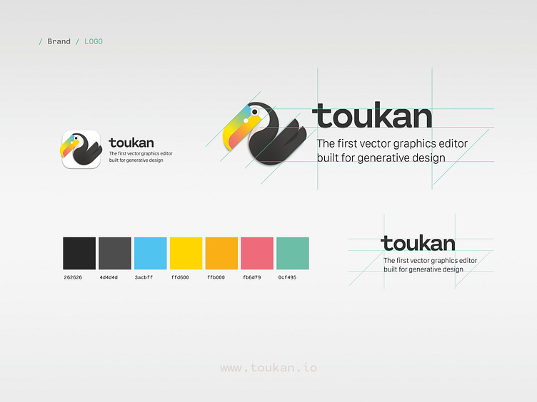
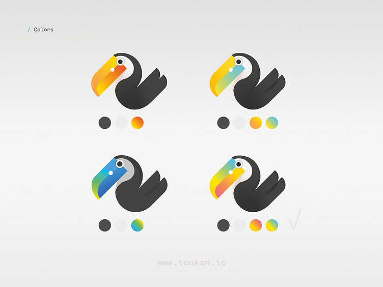
Branding is based on a color palette that matches the colors chosen for the app icon, along the sans serif font Cartograph by Connary Fagen. The font features modern attributes with a bit more stroke variations than most sans serif fonts. It offers a nice counterpoint to the exotic bird imagery, less ornemental, while still retaining a distinct look and fluid letter strokes matching the bird curves.
