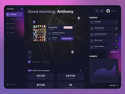
Dashboard UX UI - Vending machines
This is my response for the latest Crowwwn challenge.
Problem
When I have vending machines in multiple locations, I want to see which products are running low in each machine, so my machines are always full and making money.
Solution
I first tried to step into the shoes of the entrepreneur who needs to keep everything under control and waste as little time as possible. Must have: a refill button on every vending machine that allows me in one click to do what the app is designed to do. Having defined the mvp of the product, I followed an iterative design process, adding features that can conform well with the basic idea. Finally, I worked on the UI making it appealing is usable at the same time.
More by Marco Amato View profile
Like
