New Experticity Training Player
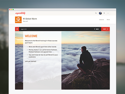
We are changing the look of our training player and edu-game that users will come to learn about our brands and be rewarded in result. Here is a screenshot of the training player. The screen size of the player is larger and easier to read. The navigation is also easier than it was before, where all the nav is at the top, instead of getting lost at the bottom. Through testing, we've found the navigation was better on top as you make your way through the training and the edu-game at the end.
We've also made all of our screens responsive, so that it's easier for all of our users and which device they are viewing the content. I have attached all of the size breakpoints we decided on.
More by Experticity View profile
Like


