News website UI - redesign of De Tijd
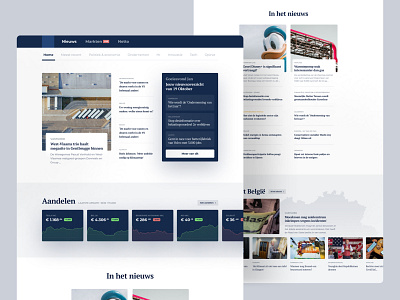
Inspired by the Belgian financial newspaper De Tijd, I created a redesign of their homepage. I tried to improve their UI with a couple of things:
- a personalized news section on top of the page
- change in background from light yellow to a fresher blue
- softened design with rounded corners, large drop shadows and texture
- use more photography
- take full advantage of screen width
- display more info on stocks and visualize charts better
- add specific landcards on subjects as “news from Belgium” or “news from a specific regio”
--------------------------
More info about De Tijd:
it’s a Dutch-language daily newspaper in Belgium. First printed in 1968, it reached another milestone on February 23, 1995 when it was first Flemish newspaper to have a website. Today you can also download their app. As a reader, I was inspired to experiment with their UI design.
--------------------------
👉 UX/UI design made by: Timo Meyvisch
👉 Link to the original website
👉 Tags: financial news site UI design, news homepage UX/UI design, newspaper website UI design, concept UI design for news, business paper
