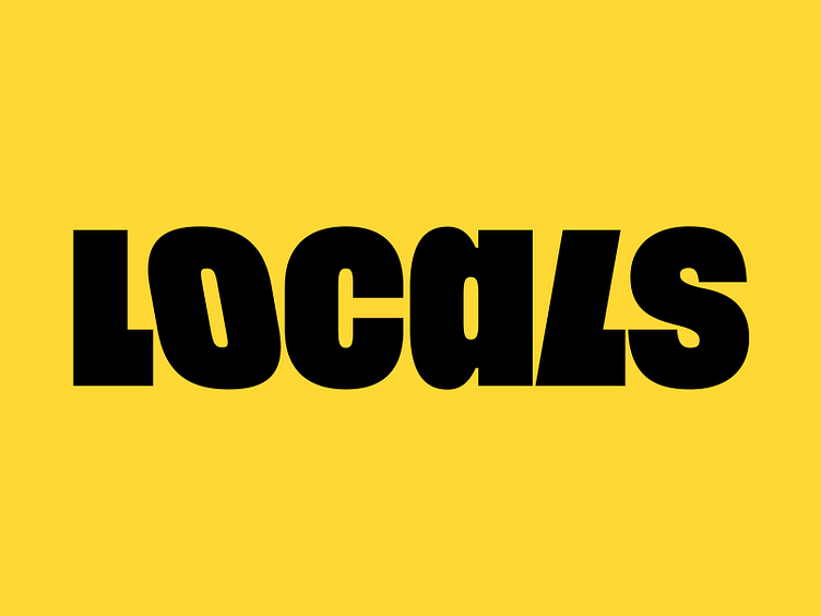
Locals logotype
Design is a source of growth for your business.
Even if you feel like all your brand needs is a logo update, you still have to think about the big picture and answer some questions about your core values and overall strategy.
What is important to you? How will you convey this to your audience? What should the changes achieve?
When Locals.org asked us to build a new version of their logo, we suggested these changes based on their answers:
1️⃣ Making it more approachable. An app that invites users to connect in person prompts a more humanistic design.
2️⃣ Improving adaptability. Bridging the gap between online and offline interaction requires a logo that fits any medium.
3️⃣ Making it consistent with Graphik, the typeface used in the app's interface and communication layouts.
In six sprints, we proposed an updated Locals.org logo with a friendlier tone, improved lettering, and three versions for use at any scale, from a billboard to a cell phone screen.
By using a flexible and dynamic process, we helped the team quickly identify the changes they needed to implement for a more effective branding. Our collaboration served as the foundation for the new logo that
Locals.org created in-house.
Let's stay in touch! Find out what we're up to:
| ESH gruppa | Instagram | Behance | LinkedIn | Twitter | Pinterest |
