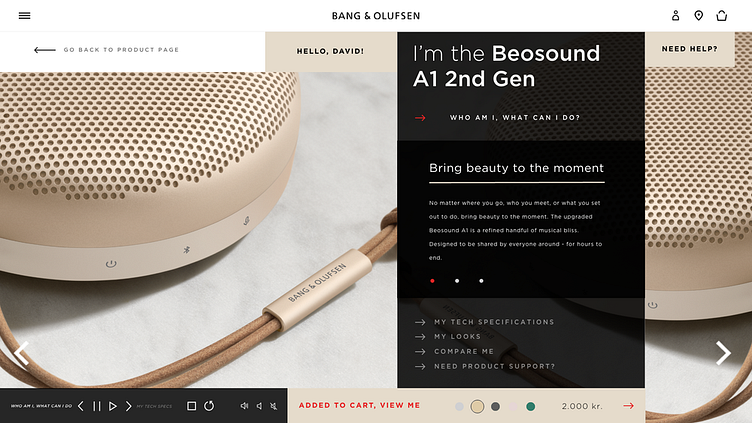
Bang & Olufsen - a new online shopping experience
The brief for this case study was to take 3 pages of the current b&o.com page and ‘turn it into something beautiful and unexpected,
that reflects a visual shift in the brand’.
Design of product page
I based my case on the Beosound A1 2nd Gen - one of the brand's best selling product and one that talks to most users.
Based on research, I conceptualized visuals around the following two aspects:
Bring a personal “in-store” experience online and making buying decisions visually more efficient, easy and pleasant for the eyes.
Evoke curiosity to strengthen user’s buying choice and customer journey visually, by making the interface more playful in an elegant way.
Design of payment and check-out pages
Aligned with the concept, the two following are designed around the same principle of bringing a high-end and personalized in-store experience online.


