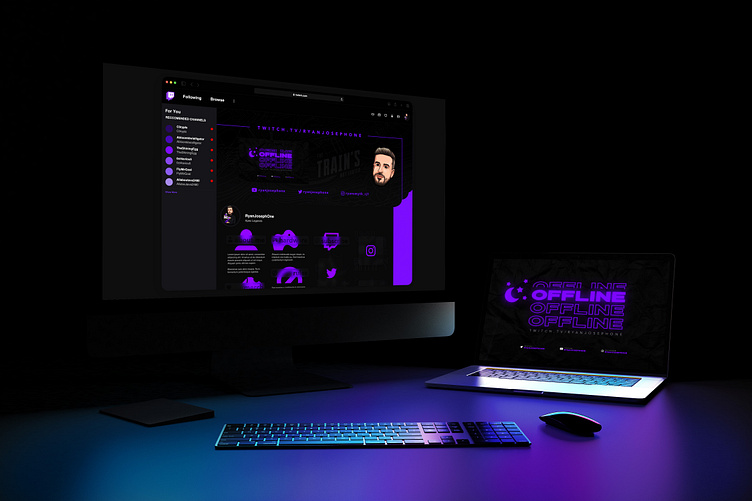
Twitch Video Game-Streaming Profile Rebrand
This was a twitch profile I designed, including a header, several overlay screens, and title banners.
The Outline
The client wanted a number of details included in the design, first being a train specifically inside the game, Apex Legends. I started by sketching the train using a still from the game itself.
Next, the client wanted a phrase included that he had commonly used amongst his fellow gamers; something which added a level of personalization to the design. I took the phrase "The train's not looted", and stylized it in a typeface similar to the game he regularly plays.
Lastly, the client requested to include Nike Air Force Ones in some aspect of the design, as it's something he has a strong passion for, and personally collects.
I added a few doodles of the shoes, as well as a sketch of the air force logo.
The Results
Here is the banner after adding some juice & colour, followed by a number of banners I created reflecting the same identity. When compiling research prior to starting the design, I noticed the twitch platform's default banner/titles were boring, and a lot of the users' banners were 2D and rather dated. I decided to give my client a more up-to-date modern look to stick out on the platform. I took the background colour already used in the twitch profile (underneath the banners), and used the glassmorphism technique to make it seem as though the titles were popping out of the screen. I also used a similar approach to allow the banner to blend more seamlessly with the previously-sharp/abrupt cut in the page (between the header and the profile blocks).
Responsive
I wanted to take the design one step further and include an extra element of responsiveness to his profile. The twitch UI forces all profiles to include a coloured bar (see red below on the left), and staying on the theme of creating something that blends seamlessly, I designed the banner to feel as though the background image never ends.
Alternate Colour
The client gave me two options for the colour scheme, red and purple, and being indecisive as I am- I couldn't help but do both.


