Travel Landing Page
💌 Have a project idea? We are available for new projects!
hello@ronasit.com | Telegram | WhatsApp | Website
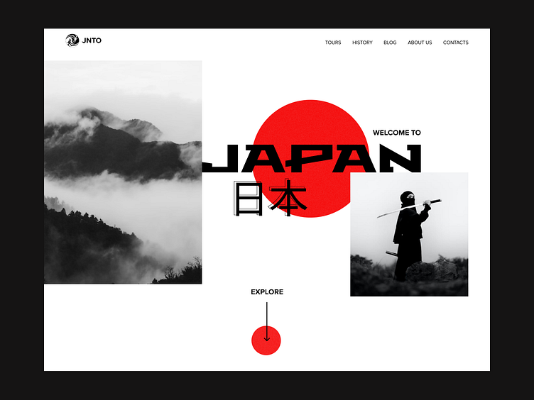
Hello! This is our concept of a landing page that can be used for promoting the services of the travel agency. Let’s take a closer look.
The landing page displays photos of Japanese destinations and their descriptions.
The color scheme of this interface consists of black, white, and red colors. These colors are usually associated with Japanese culture.
The red round shapes in this interface can be associated with the Japanese flag. The color palette doesn’t distract users from observing eye-catching photos.
More by Ronas IT | UI/UX Team View profile
Like


